
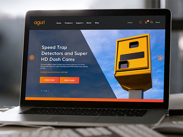
Digital Projection
Cornerstone’s expertise keeping market-leading Digital Projection in its rightful position
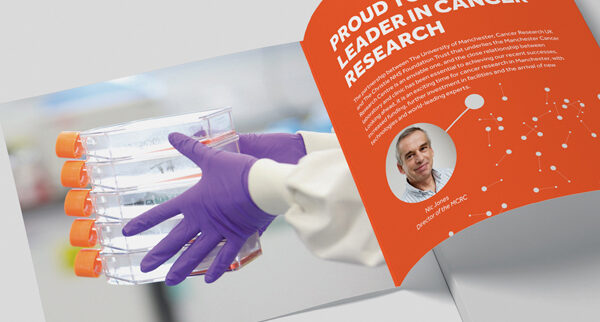
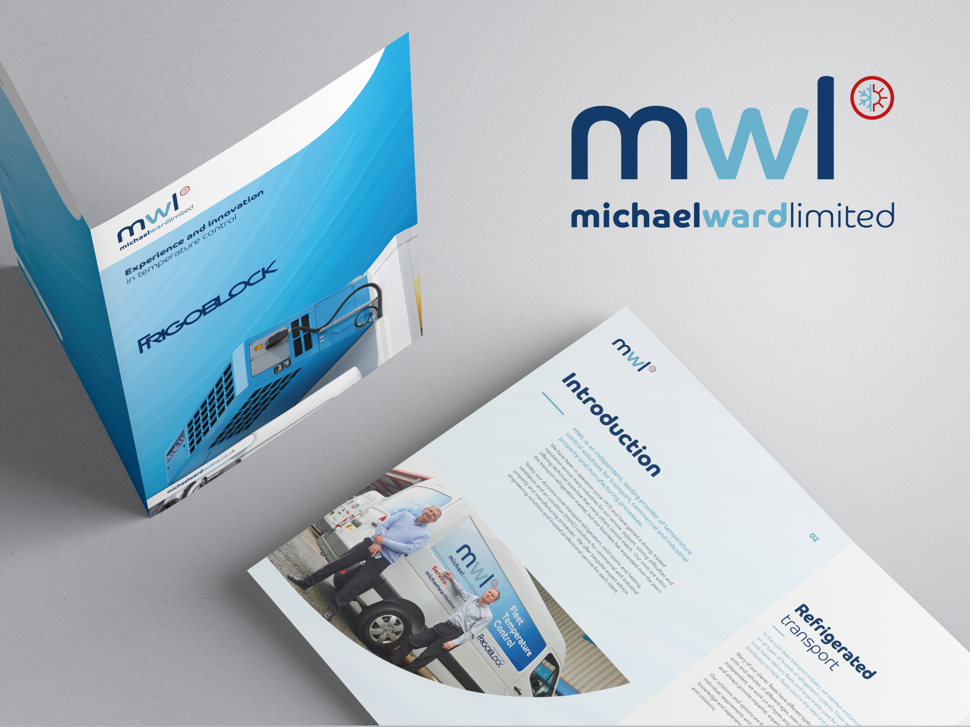
A digital imaging pioneer and industry leader, Digital Projection manufactures and distributes an extensive and expanding array of ultra-high-performance projection systems across the world.
These projectors are the benchmark for demanding applications such as large-venue, live-event staging, education, medical and scientific research applications, command and control centres, digital signage and cinema, commercial entertainment, houses of worship and elite residential entertainment.
Digital Projection was formed in 1987 and is renowned for its instrumental role in developing new technologies pushing its sector’s boundaries.
The Manchester-based organisation was the first to market with 8k laser technology, first to market with a new satellite system, and often first to market with new applications and integrations for events and attractions worldwide – innovation and expertise that has garnered the business multiple awards and huge respect in equal measure.
So, when the time came for Digital Projection to update its ageing website, it was gratifying to see the best choosing the best to work on this project.
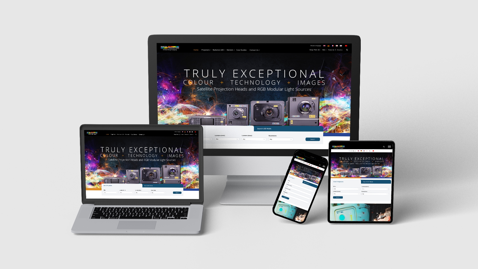
Digital Projection wanted a new website that reflected its prestigious brand position.
The demands of the new site were multi-layered. It had to be easier to manage and control, multi-lingual, integrated with back office systems and databases, SEO-friendly and more flexible for its marketing teams to edit and develop.
But first, we had to navigate a competitive tendering process from which our proposal and solution were selected as providing the strongest and most effective outcomes, some of which were down to our in-depth process of extracting market information, customer insights and customer journeys.
The website being replaced was built on WordPress and Digital Projection wanted to remain on that platform – no surprise given that approaching half of all websites on the internet are built on WordPress – a figure which continues to rise consistently.
WordPress can be updated with minimal fuss, ranks well in Google, and means you don’t have to contend with any of the coding complexities of a HTML-based site.
It contains plug-in architecture and a template system, that can be customised to create endless possibilities with thousands of free and premium plug-ins that can be used to extend a website’s functionality.
Here at Cornerstone, we don’t just ‘do’ WordPress development, we truly live and breathe it.
We launched the project with a full analytics review to understand Digital Projection’s current market position and to identify any opportunities and gaps within the market that could be exploited.
With this data, coupled with competitor benchmarking in place, our team of WordPress experts set out on our user experience (UX) process, which involved a workshop delivered across the UK, US and Europe to glean much-needed insights into the best structure to be delivered for Digital Projection to maintain its eminent position in the industry.
From here, our team worked up wireframes, UX strategy, customer personas, information architecture and site structure, all aligning with user journeys, corporate goals and objectives, and data and analytics insights.
As a full-service agency we have all the expertise required for a prestigious project of this nature under one roof, and with satisfaction high with the work we delivered, we moved the approved wires into our design studio for brand application and positioning work.
Both mobile and desktop views were carefully crafted to meet the client’s required brand positioning and criteria, which were signed off quickly in anticipation for our web team to start the website development.
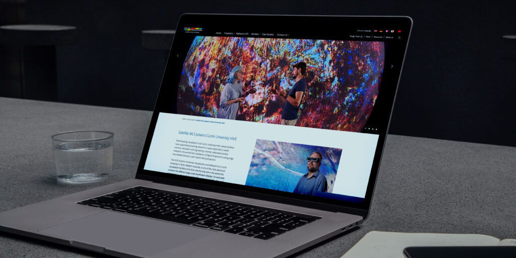
This began with the development of the core CMS (content management system) structure and front end view, which was later coupled with internal databases that powered specification sheets and product documentation from a central repository, as well as integration into back office systems such as Sales Force and Marketo.
A unique and highly bespoke customer portal was developed for US visitors, allowing customers access to various supporting documentation and product knowledge intelligence, specific to each customer and application.
We developed the site using a bespoke build WordPress CMS, which used Gutenberg’s flexible block editor. This means Digital Protection can re-use and re-purpose blocks anywhere on the site, giving them total control and flexibility, thus fulfilling the brief for the site to be more flexible for its marketing teams to edit and develop.
Our team also developed a number of custom PHP scripts – a general-purpose scripting language that can be utilised to create intuitive and dynamic websites – to handle and manage connections to third party databases and Application Programming Interfaces (APIs), in order to ensure the safe and efficient transfer of data to and from the website.
And we undertook detailed Google Tag Manager work to ensure we captured key goals, conversions, and web events throughout all languages across the site, as well as the launch of a content distribution network (CDN) which delivers faster site speeds in all countries by serving them out from localised servers, whilst bringing additional security benefits.
Once completed, the site was handed over to Digital Projection for content entry following a training session on how to use the site and best practices.
It was then signed off and sent back to our development team for launch, which involved carefully handling over 6,000 global site redirects, vetting live versions of the site across multiple VPNs and setting up a complex language access protocol, allowing visitors from different territories access to certain areas of the site.
The project successfully launched in late 2022, ready for a series of trade exhibitions and shows such as the Integrated Systems Europe (ISE) expo in Barcelona, where its presence is always highly anticipated for showcasing its class leading, high-end projection products and technologies.
If you would like our expert WordPress team to enhance your business or organisation, get in touch for a friendly, informative chat.
Whether it’s a landing page or a full e-commerce site, an online learning academy or an interactive informational site for your business or organisation, we can build it for you.


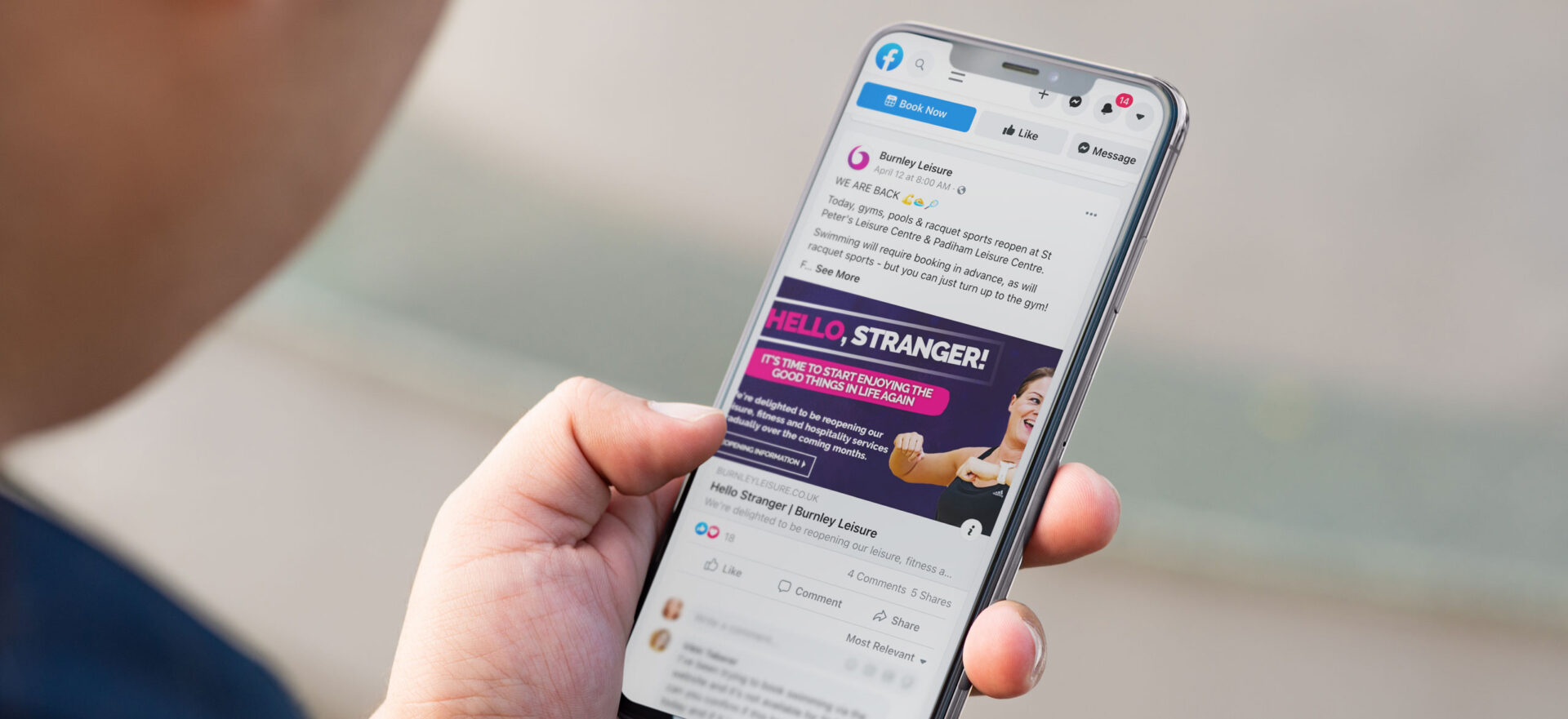
Burnley Leisure
Burnley Leisure is a fast-growing, entrepreneurial leisure trust which goes way beyond simply being a traditional health and fitness operator.
It has a strong cultural string to its bow through the running of the historic Burnley Mechanics Theatre.
It operates a number of sport and recreational sites alongside it’s two leisure centres including golf courses, an athletics track, hospitality venues and The Boathouse, a park-based facility offering boat, kayak and canoe hire and a popular café.
It is an all-encompassing charitable trust dedicated to the health and wellbeing of the people of Burnley and surrounding areas, driven by the vision: ‘To make a real difference to the communities we serve’.
But due to its rapid growth and expansion in recent years, Burnley Leisure’s well-honed offering wasn’t centre stage for its audience.
Individually, venues lacked a joined-up business and marketing approach, resulting in silos competing for share of voice and consumer attention.
Find out how we’ve been helping Burnley Leisure to unify its voice and tone up its marketing activities with the aim of shining a spotlight on its fantastic facilities for years to come…
A reputation for results
The foundation of our partnership with the trust exemplifies Cornerstone as an agency; ‘Built around results, recommendation, strong working relationships and reputation’.
Burnley Leisure approached us in early 2019 following a recommendation from a fellow leisure trust for which we’d previously carried out a full marketing audit.
As leisure sector specialists we regularly conduct these investigative, in-depth reviews on behalf of clients.
Led by Cornerstone MD David Wadsworth, the audit drills down into current marketing practices, needs and requirements to form a robust and comprehensive road map of activities.
These defined objectives help to reposition and refine a client’s existing marketing strategy for long term success.
As well as unearthing the potential to unify the arms of the business, the Burnley Leisure audit identified a need to synchronise digital touchpoints such as social media and ramp up online marketing.
Our research covered multiple aspects, delving into consumer and competitor landscapes as well as internal structures and staff.
This gave us a strong understanding of brand and digital interactions and in-centre experiences, allowing us to form a carefully considered strategic review to drive on-going success for years to come.
Redefined and aligned
A master marketing plan emerged following a series of trust-wide consultations, brand strategy workshops, skills audits and departmental insights.
This two-year strategy was designed to redefine the trust in terms of marketing collaboration and consumer perception.
The recommendations were filtered into a 12-month marketing planner with distinct goals and objectives for both sides to work towards.
It included a unified rebrand under which to house the individual Burnley Leisure venues and offerings and a plan to reposition the trust within its core demographics.
Its online presence was to be re-invigorated with a new, bespoke built website development, packed with SEO tools and API integrations into third party providers.
Essentially it needed a strong and effective UX strategy to help users navigate the site effectively, while exposing them to more activities and recreational offerings than ever before.
A social media strategy was implemented to increase audience reach and engagement alongside PR planning to raise brand awareness and reputation within its locality.
There was a strong member recruitment and retention focus through the integration of systems such as timetable, membership and marketing software and a cross-selling strategy across the organisation which was underpinned by email marketing.
And throughout, there was an emphasis on upskilling and supporting the trust’s teams to aid the successful implementation and delivery of these renewed marketing and sales efforts.
The stats
So, here’s what you really want to know.
Was it actually achieved?
While there’s always still work to be done, we think you’ll agree there’s been some impressive results to date.
Website:
- 18% increase in web sessions via the new website
- 19,000 new users visiting the website in year 1
- 85% increase in sessions
- 57% increase in page views
Social media:
- 30% increase in total Facebook likes
- 116% increase in Facebook engagements
- Organic Facebook reach of 1.26M
- Paid reach of over 173,000 with above industry average CTR
- Instagram follower growth of over 37% with reach nearing 50,000
- 85,000 Instagram impressions
PR:
- 206,000 total reach via earned PR activity
- Earned media value of over £37,000 within a 6-month period
- Digital PR (earned) reaching over 80,000 of our target audience
Membership and email marketing:
- Exceeded membership targets for all campaigns delivered in 2019/20
- Email marketing open rate averaging between 40-50% with CTR well above industry benchmarks
Unified success
Delivered in a structured format that delivers against KPIs, marketing has helped to significantly increase ROI.
Brand perception among consumers has risen as well as awareness of the wider Burnley offering with proven cross sells now taking place and enhancing the overall Burnley Leisure experience.
Bringing the brands together has helped create a stronger more cohesive customer experience, and one that is now driving recommendation and referral.
Digital touchpoints have also increased, particularly during the first wave of the pandemic.
Social media marketing helped Burnley Leisure to keep in touch with their members, followers and the wider community through the use engaging, supportive content.
From online workouts and quizzes to health and wellness schemes for the elderly and vulnerable, its social platforms helped to inject some much-needed fun, joy and energy into a community the trust are heavily invested in.
Forging a healthy future
We’re proud of what we’ve achieved so far, and we’re delighted that Burnley has seen the immense value of our full-service offering, ongoing as part of a monthly retainer.
Further investment in the trust’s marketing activity continues and, at the time of writing, an exciting brand roll out is imminent across all its centres.
Time to introduce the lead strategist, Cornerstone MD David.
“Burnley Leisure has been an exciting client to work with from the very beginning.
“What’s refreshing is their entrepreneurial and commercial approach to their activity. They have a very dynamic, forward thinking way of delivering exceptional experiences to their customers.
“We started out with Burnley as a consultant, helping to get under the skin of their business and its marketing activity, to understand where improvements and enhancements could be made.
“From carrying out our initial audit, we were immediately invested and engaged, and were grateful to be given the opportunity to help develop their brand and marketing strategy into the cohesive, high performing entity it is today.”
Don’t take our word for it
“We spent several months discussing the best way to improve our marketing although we had been successful, we knew we needed to step up to another level if we were to continue to grow the business further.
“After interviewing several companies, we decided to work with David and his team at Cornerstone, impressed with their down to earth approach and a talented team with different skills to work with.
“We spent around 6-8 months reviewing everything in detail throughout the business and then prioritising a plan of action to move forward.
“We started on a journey initially to consolidate our brand with a refresh and ensure our key messages were being promoted along with developing a new website and overhauling our social media channels. The Covid-19 pandemic meant adapting our plan and Cornerstone proved invaluable in scaling up our digital and online presence during lockdown propelling this area forwards at speed much quicker than many of our competitors giving us a competitive edge.
“We are still on a journey continuing to adapt and move forward with our plans, our brand is stronger, and our community awareness is bigger than ever putting us in a good position as we come out of lockdown.
“David and his team are a delight to work with and they have a real partnership approach not just a customer client relationship and would recommend them if you need to upscale and review your marketing operations big or small.”
Neil Hutchinson – Head of Group Operations at Burnley Leisure
The perfect fit
At Cornerstone we’ve been working as reputable, renowned and trusted specialists with regional leisure clients for over a decade.
We offer expertise across marketing strategy, digital, design, PR, web development, print and signage.
As a full-service agency, we’re able to provide a complete package of well worked out marketing disciplines to either compliment the skills of in-house teams or as a strategic partner.
If you’re looking to seriously tone-up your marketing output, get in touch on either 0161 213 9941 or at clients@cornerstonedm.co.uk.
You can keep up to date with our client work and latest industry insights by connecting with Cornerstone Design & Marketing on LinkedIn.

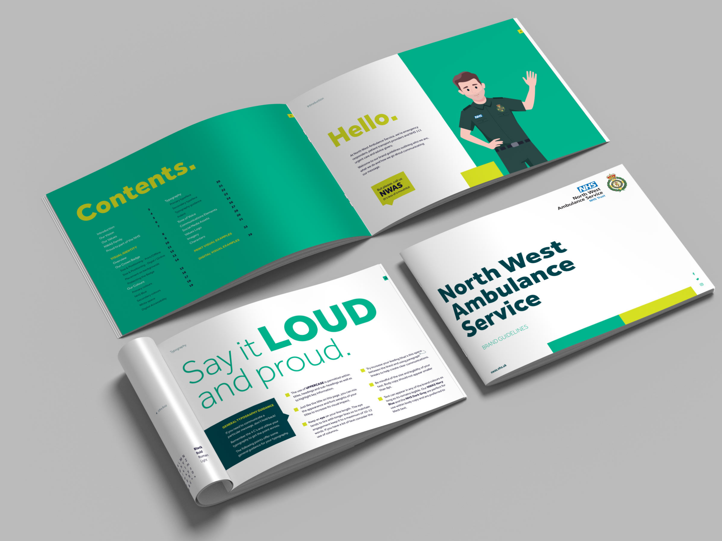
GM Active
Never have the leisure, health and wellbeing, and culture sectors been more important in our lives as our communities recover from the debilitating effects of three national lockdowns caused by the COVID-19 Pandemic.
But we’ve drawn on all of our strategic prowess and creativity to capitalise on a myriad of marketing opportunities to provide a full-service workout on behalf of GM Active – which is strategically focused on offering schemes and pilots that aid collaboration and resource sharing across the GM city-region to deliver health outcomes that cannot be achieved more locally or individually.
A community interest company (CIC), GM Active is leading the way in repositioning the publicly-owned leisure sector to better-meet current and future population health and wellbeing priorities. This transition from the sector’s traditional ‘fitness and facilities’ offering to a more-targeted approach to public health and wellbeing focus will bring greater health, social and economic benefits to individuals, communities and businesses with the aim of making us all healthier, happier and more productive.
From Zumba and spin classes to targeted support for patients with particular physical or mental health conditions, GM Active’s member organisations enhance many lives in many ways as well as offering wider social, health and economic benefits.
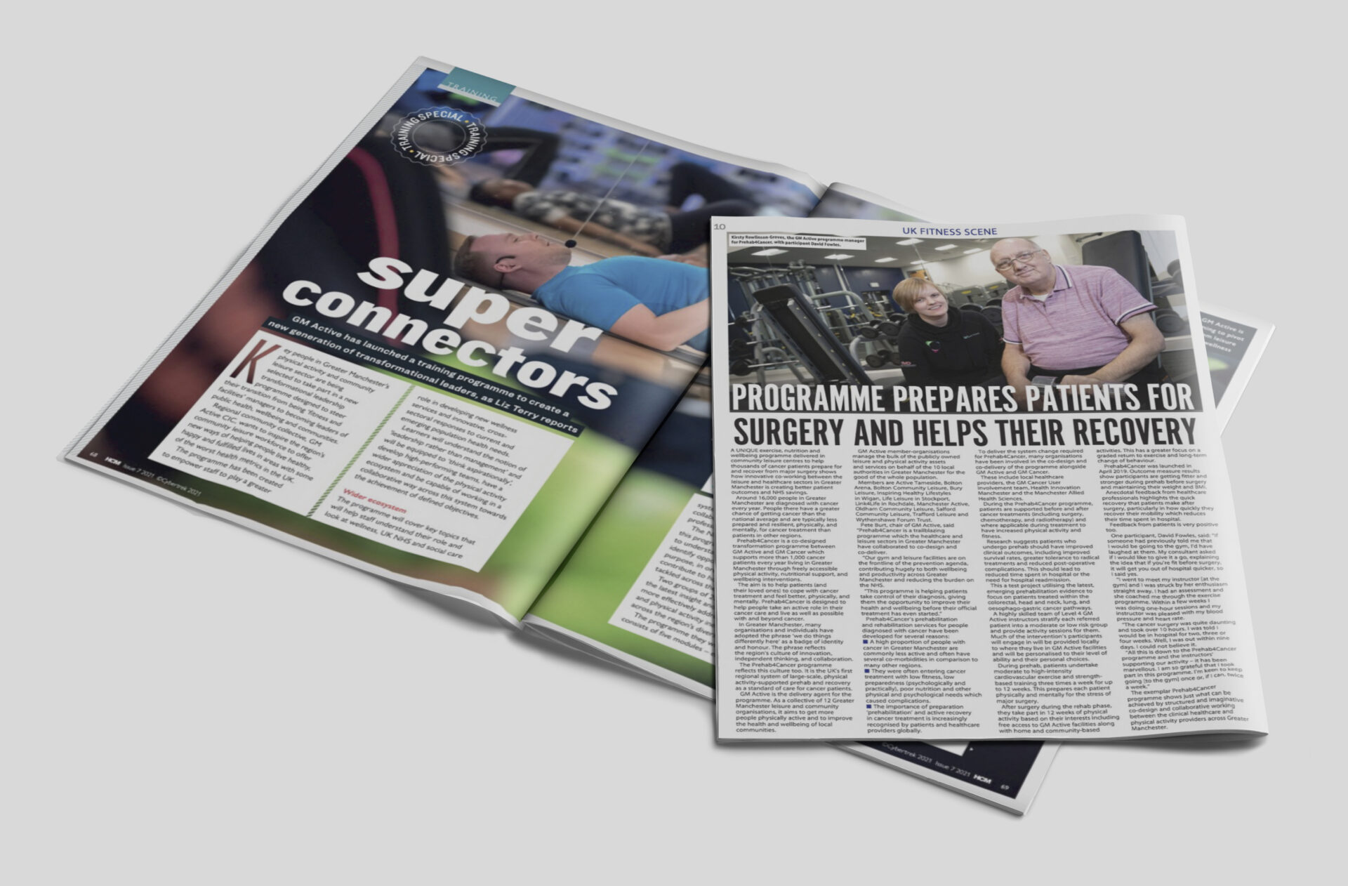
Health and wellbeing services include targeted exercise and advice for people with specific health conditions and disabilities, or additional needs. Services include Prehab4Cancer (P4C), a ground-breaking programme to help people with cancer prepare for and recover from surgery or other major treatment. This is delivered in local gyms throughout Greater Manchester and, since the pandemic, via home-based sessions delivered remotely by P4C’s exercise specialists.
An intrinsic understanding of markets and audiences
Cornerstone’s services for GM Active include strategic marketing, PR, media handling and planning, as well as aiding the growth of digital footprints, brand reach and recognition through social media activity.
We’ve worked closely with a diverse range of leisure clients for over a decade and developed an intrinsic understanding of their unique markets and target audiences. Their end-customers and stakeholders can range from members of local gyms, swimming pools or spas, to performing arts audiences and public sector professionals, such as GPs or local authority commissioners who buy health and wellbeing services for patients and target groups.
The diversity of our services reflects this breadth, ranging from sales-focused gym publicity, hospitality and theatre campaigns, to creating public health campaigns, news-writing or PR activity aimed at leisure sector professionals, stakeholders and politicians.
Examples of our marketing insight, services and capabilities are well-illustrated through our work with GM Active.
Leading the field in collaborative projects
GM Active’s member organisations are primarily not-for-profit charitable trusts which collectively run over 100 venues including leisure centres, family attractions and performing arts venues.
GM Active is a leader in its field for collaborative projects. It works with partners including GP surgeries, hospital clinical teams, health researchers, NHS organisations, local and national government, universities, charities, local authorities and Greater Manchester Combined Authority to reach shared goals around health and wellbeing within our communities.
GM Active members are: Active Tameside, Bolton Middlebrook Leisure Trust, Bolton Community Leisure, Bury Council, MCRactive, Life Leisure, Your Trust, Oldham Community Leisure, Salford Community Leisure, Trafford Leisure, Wigan Council and Wythenshawe Forum Trust.
At national level, GM Active works with organisations including Sport England, UK Active, CIMSPA and Community Leisure UK on joint campaigns and projects to boost public health and wellbeing.
In the beginning…
Our first contract with GM Active followed a recommendation from other individual trusts in Greater Manchester impressed by what we had accomplished on their behalf. They suggested Cornerstone’s strategic approach and full-service offering would help to better-position GM Active with its stakeholders, our creative team would help to better-align the GM Active brand to market expectations and our digital and PR teams would target GM Active’s key audiences efficiently and effectively.
In the early days we carried-out an onboarding workshop to better-understand all GM Active’s objectives. This involved speaking to each member-organisation’s chief executive, board directors, marketing and communications leads, and various groups which deliver schemes within local communities. Once we had all these elements, we formed a 12-month plan to help GM Active meet their collective objectives.
The early objectives included creating a reciprocal membership campaign, giving members of each leisure trust access to certain types of leisure amenities across all ten Greater Manchester boroughs, such as pools and gyms. So, for example, a member of a Manchester trust could go for a swim or gym session at facilities run by GM Active members elsewhere in Greater Manchester. This required web technology to enable different trust’s IT and membership systems to interact, so members were granted access to leisure centres in all the boroughs involved.
Other elements of the membership campaign included written, social media and video content aimed at consumers, reciprocal leisure centre location finders on websites and website user-experience enhancements; cardboard strut cards to be displayed in leisure centres and reciprocal membership launch activities for GM Active partners.
#saveleisure lockdown lobbying
The world changed dramatically when the COVID-19 pandemic struck in 2020 resulting in the first of three national lockdowns. And that meant significant changes were needed to our plans. In response to the dramatically changed environment which GM Active faced, we completely adjusted our strategy and tactical plan. We worked with GM Active to reconsider our approaches and annual objectives during the pandemic lockdowns and our future delivery of marketing activity.
Closure of leisure centres and cultural venues raised numerous short-term challenges for GM Active member organisations and the wider leisure and culture sectors, especially around loss of revenue and ongoing costs of maintaining closed leisure centres. As the sector reopened, GM Active’s objectives moved to the recovery of community leisure trust operations and services, and in developing the community leisure sector towards a more public health-focused ‘wellness service’.
In the following months, GM Active and national leisure sector organisations began lobbying councils, MPs and the Government to raise awareness of the sector’s financial needs as a result of lost income and the public health and social impacts of the lockdowns.
The #saveleisure campaign promoted a better understanding of the sector’s professionalism, strong hygiene standards, readiness to reopen safely and its skills and capacity to boost public health, recovery and resilience.
To communicate these messages, we focused primarily on social media and PR services for GM Active. We had a clear target and emphasis on local and national government, helping to raise awareness of the leisure sector’s positive impact on communities and how funding was vital. We also worked with organisations such as Sport England and GM Moving to create content.
Getting the message out there
Our other work for GM Active has included creating press releases and social media campaigns on other services, topics and themes.
Some services have highlighted GM Active’s ground-breaking P4C patient support programme and its new Skills and Training Academy.
P4C shows how innovative co-working between the leisure and healthcare sectors is creating better patient outcomes and NHS savings. It is a co-designed programme between GM Active and GM Cancer.
Our press releases have led to diverse regional and national media coverage for GM Active, reaching audiences of up to 470,000 across print, digital and broadcast media in less than a year.
Across the north-west of England, we have helped GM Active gain coverage in print and digital channels linked to the Wigan Post, The Bolton News, Oldham Times, Bury Times and This Is Lancashire. We have also gained coverage on local radio station news bulletins.
Nationally, we helped GM Active gain coverage in leading B2B leisure and health magazines and channels, further raising awareness of their ground-breaking work and thought leadership within the industry.
Making a social media impression
Our social media activity complemented the press coverage and helped to raise GM Active’s profile on LinkedIn and Twitter.
Messages emphasised the positive impact that leisure has on the community in providing vital services for many, especially the most vulnerable.
Our social media posts also shared statistics to remind people of the impact GM Active and its members have on the communities of Greater Manchester.
Before working with Cornerstone, GM Active’s social media activity had been infrequent. We increased the frequency of posts, engagement with member organisations and shared industry news from associations such as UK Active and Sport England. We also created news blogs for GM Active’s website, increasing engagement and reach via social media marketing.
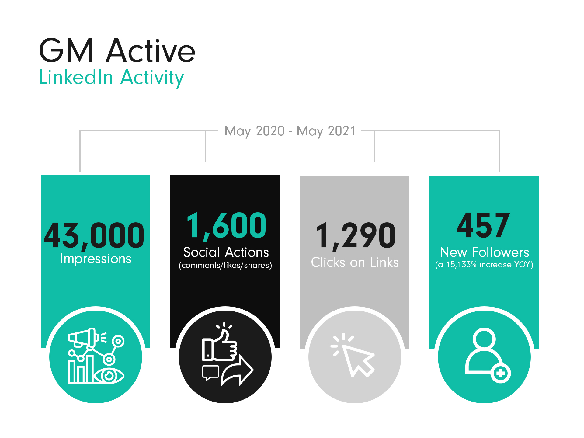
Between May 2020 and May 2021, GM Active’s LinkedIn activity gained 43,000 impressions, 1,600 social actions (comments/likes/shares) and 1,290 clicks on links. Their following also grew by 457 (a 15,133% increase YOY).
GM Active’s Twitter following grew by 20%, impressions rose by 396% and likes grew by 408% YOY. We increased the number of tweets posted by 192%.
Our creative team produced a reopening video to visualise how much people had missed their local leisure centres. Visual features included snappy motion graphics and statistics and GM Active’s on-brand colour palette.
Marketing services of real value
Because marketing and communications in this sector is complex, it is essential that leisure organisations have the right strategies, tools and skills to filter their different audiences, and benefit from marketing services of real value. This is where Cornerstone comes in. Our services for GM Active were adapted throughout the pandemic and we’ve grown to support them further as the landscape has changed.
Now that leisure and culture facilities have reopened, leisure operators face a changing role in future with a greater focus on health, new types of service delivery, partnerships, training and research.
Supporting great work across Greater Manchester
Taking the lessons learned from the last two years in which Covid has affected many leisure operators the world over, our strategy for GM Active looks exciting, and heavily focused on communicating the positive health and wellness message that each organisation strives to deliver in their respective communities.
We’re now helping to effectively launch the new ‘We Move As One’ strategy to help reduce health inequalities, increase physical and mental wellbeing within communities while easing pressures on NHS services.
The future of leisure looks positive and truly inspirational, and Cornerstone and our team are looking forward to supporting the great work being delivered across the Greater Manchester area.
Find out more
As the leisure and health sectors recover from the pandemic and develop for the future, get in touch to see how we can help your organisation. We’re renowned for our strategic and creative approach to achieve efficient, engaging and effective results. Find out more by emailing us at: clients@cornerstone.co.uk
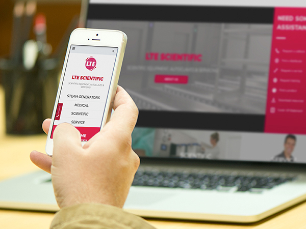
Interland
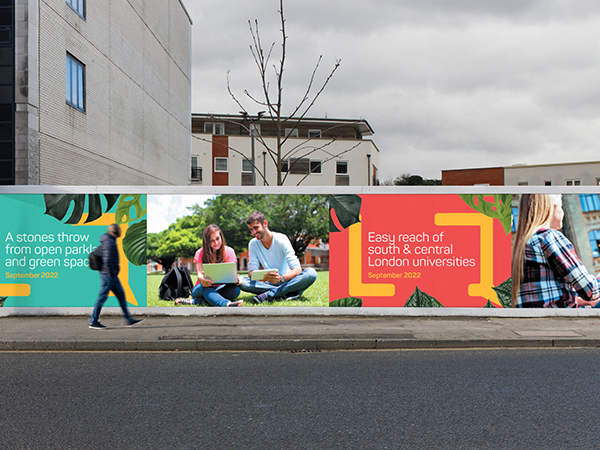
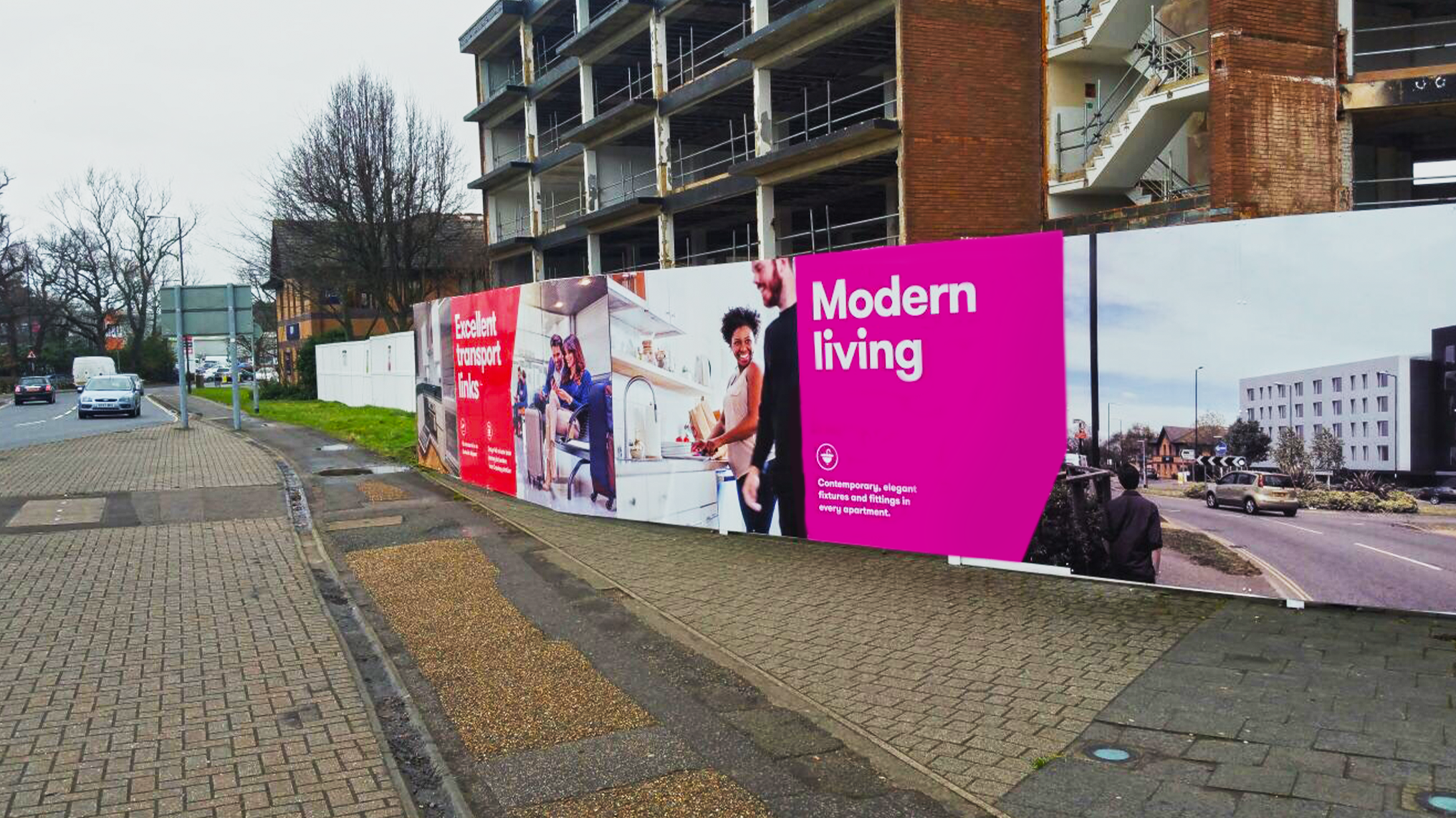
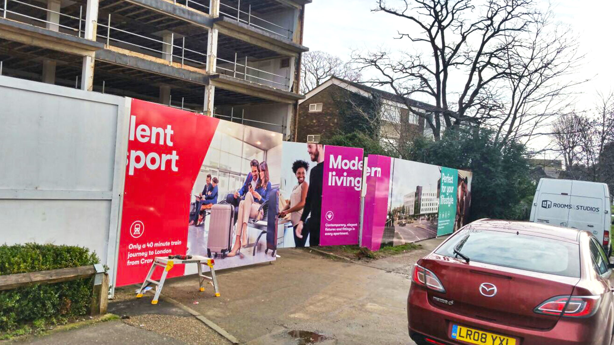
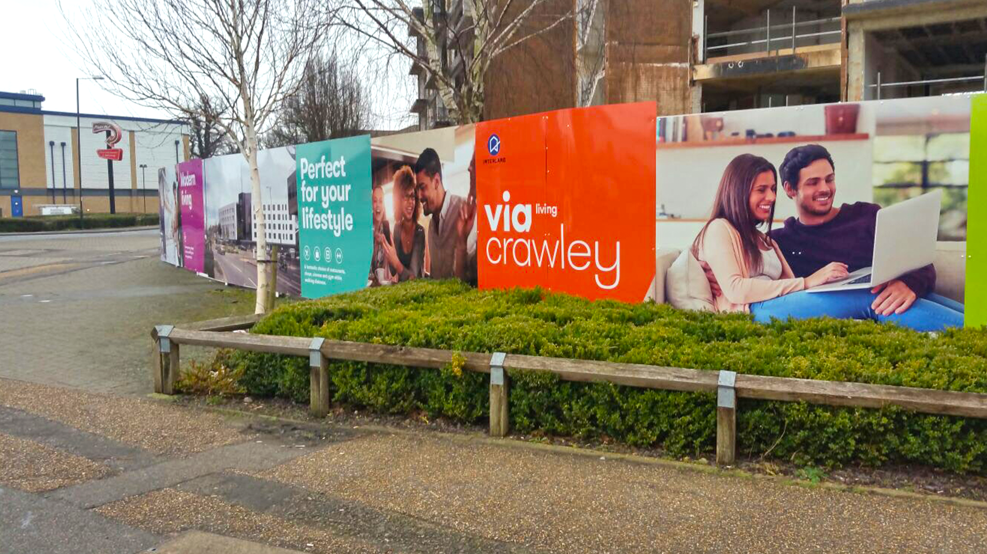
Hoarding panels are a great way of protecting your building or development, but they’re also a great advertising or promotional tool – making them a high impact, low cost solution.
When we were approached by one of our clients to provide hoarding panels to surround a building they were renovating into high quality student accommodation in the Tooting district of south London, we set about creating a highly visual solution that reflected the quality of the development and its location.
The aspirational lifestyle imagery had to portray exactly what was being created while the messaging had to be clear and succinct – grasped at a glance by passers-by.
And given the size of the site – it required 61 panels – the cost effectiveness was second to none.
Designing the solution
Living Quarters is part of the Interland Group, a property investment and development company that has gone from strength to strength for more than 35 years. As a full service agency, this wasn’t Cornerstone’s first encounter with the company, having previously provided hoarding, brochure design and digital services, including the creation and delivery of the Living Quarters website.
Their design brief asked for student lifestyle imagery, with an overall look and feel that reflected the quality and leafy, green space elements of the site, which was within a stone’s throw of open parkland. They also wanted the messaging to call out that the accommodation was within easy reach of south and central London colleges and universities.
Cornerstone’s award-winning design team boasts over three decades of experience and brief interpretation acumen.
They are responsible for bringing countless campaigns to life and that’s where the brief first landed, along with a plan of the site, where the hoardings were situated and the dimensions of the panels.
The department is the creative cog of Cornerstone, offering expertise in illustrating brand vision, eye-catching publicity and campaign concepts, to create a plan that ensured all the artwork was precise and on message.
We then created an installation plan and shared it with the client – the aim, as it is with everyone we work with, was to make the project as easy and problem-free as possible.
An exercise in precision
While the brief was simplicity itself, the execution called for precision design and execution. All the panels had to be numbered, arranged and split perfectly to ensure everything fitted the space – no mean feat when you consider the hoarding panels came in an array of different sizes!
It was akin to designing a jigsaw – albeit with straight edges – in Manchester that was going to be assembled more than 200 miles away with every single piece aligned to the millimeter.
That daunting task landed on the desk of our graphic design guru Sarah, who says: “It was a very technical project to get right. Each hoarding panel comes in a set size so you have to make sure each panel of the artwork matches the size exactly.
“We were just producing the artwork for the panels and Living Quarters were going to be installing it, so we produced a colour-coded plan showing each set of hoardings, their sizes and numbered thumbnails of the artwork that was going on them. All they had to do was look at the plan and match the artwork to the colour-coded area. So, for example, if panels 45 to 61 were colour-coded purple they went on the purple area of the plan. It had to be failsafe, and so it proved.”
Putting the plan into action
Our collaborative process means we work closely with clients until every aspect of the design and installation is harmonised.
With everything approved by Living Quarters, the project moved on to our print room, where our hoarding board print production services offer top-of-the-range print quality, colour intensity and vibrancy with perfect finishing to create the strongest and longest lasting impact.
Supplied with the numbered artwork to match the installation plan, our production team were able to get to work creating the actual 3mm aluminium composite panels that attached to the hoarding frames. Typically, our hoarding boards are 1.2m wide by 2.4m high and most of the artwork was created at those sizes, although some bespoke panels were needed to complete the run of the hoarding.
All of our hoarding fascias are printed at high resolution, with vibrant inks to make a real impact and leave a long lasting, stunning presence.
We can provide matt, gloss and anti-graffiti laminates for all applications, and can colour match anything required to match existing or old hoardings. On this project we used a 210 gloss laminate, which has a lifespan of approximately five years, at the client’s request.
Conclusion
Collaboration, design and execution meant the whole project was delivered on time and on budget within the space of two months.
No job is too big or too small – we can produce whatever you want and fit it to any type of site, from level areas to sloping and curved sites.
And given the size of the site – it required 61 panels – the cost effectiveness was second to none.
Get in touch
We offer a comprehensive site survey service where our installers will help find the right solution to your hoarding board requirement.
They’ll take you through installation tips and techniques, and advise on best materials, layouts and formats. We’ll ensure your project is well informed, planned with accuracy and initiated with the right materials and products to guarantee a pristine end result.
As this project proves, investing in good design is critical and Cornerstone’s design team boasts over three decades of combined industry experience to help bring any project to life.
As a full service agency, we are more than capapble of including your hoardings in a full marketing strategy, or a wider campaign, if you choose. We’ll make sure your hoarding is consistent in brand identity and messaging, and any calls to action are optimised. We can make your hoarding as creative, inventive and interactve as your budget allows.
Get in touch today and allow us to bring your hoarding panels to life.
Our Work
Care
We’re taking Care of a great British brand
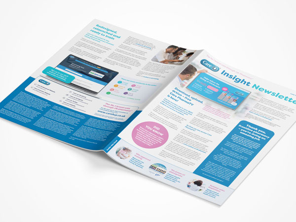
Working with Care, the No.1 brand sold through UK pharmacy*, has been a fascinating and rewarding brand journey for Cornerstone, and one that has helped forge some strong industry organisation and trade media relationships which are helping the brand to embrace a new era.
As one of Britain’s leading over the counter (OTC) brands they were perceived as having a more traditional outlook in the marketplace. They were seeking a change in direction and looking to evolve the brand to help broaden their reach and reinforce the messaging around the scope of their unrivalled range of products and pharmacy support.
You’re about to find out the part Cornerstone has played in the healthcare and pharmaceutical marketing support – helping to drive this superb pharma brand forward within the industry.
Developing a brand that prides itself on providing quality and value
As part of our creative and brand development programme, Cornerstone helped Care to fully reposition its brand identity to better reflect its position as a leader within the independent UK pharmacy market.
Drawing on our creative teams’ skills and experience, we developed a new look brand identity.
This was rolled out across its trade and consumer channels to reaffirm its No.1 status and re-engage with customers within the trade as well as consumers – the generations of families who have turned to the brand during their times of need.
This was the first step in ensuring a stronger appeal for the brand and a more cohesive visual identity.
Leveraging a proud brand to become louder
Historically Care was seen as a traditional brand within the marketplace and therefore needed to fire up its brand presence to keep the product range front of mind with its target audience of healthcare professionals.
First things first.
We researched and developed a long-term PR and digital media strategy.
We then began targeting the strongest, most relevant publications and organisations across the UK pharmacy market to loudly and proudly promote the brand’s unique and powerful messaging; that Care is the No.1 brand sold through UK pharmacy*, offering one of the most comprehensive ranges of quality, largely UK-manufactured OTC medicines and remedies on the market, for almost every minor health concern.
Our work saw the brand shift swiftly from its ‘traditional’ reputation to having a clear and prominent share of voice within the market.
We achieved a staggering PR audience reach of well over half a million – 580,059 to be precise – across print, online and email marketing in just four months.
Developing digital tools that add real value
Another critical part of our work for Care was to develop digital tools that could add real value for healthcare professionals.
Our aim was to also ramp up the brand’s offering as a crucial pharmacy support partner in what is a rapidly changing primary care landscape due to the NHS emphasis for patients to self-treat minor health conditions.
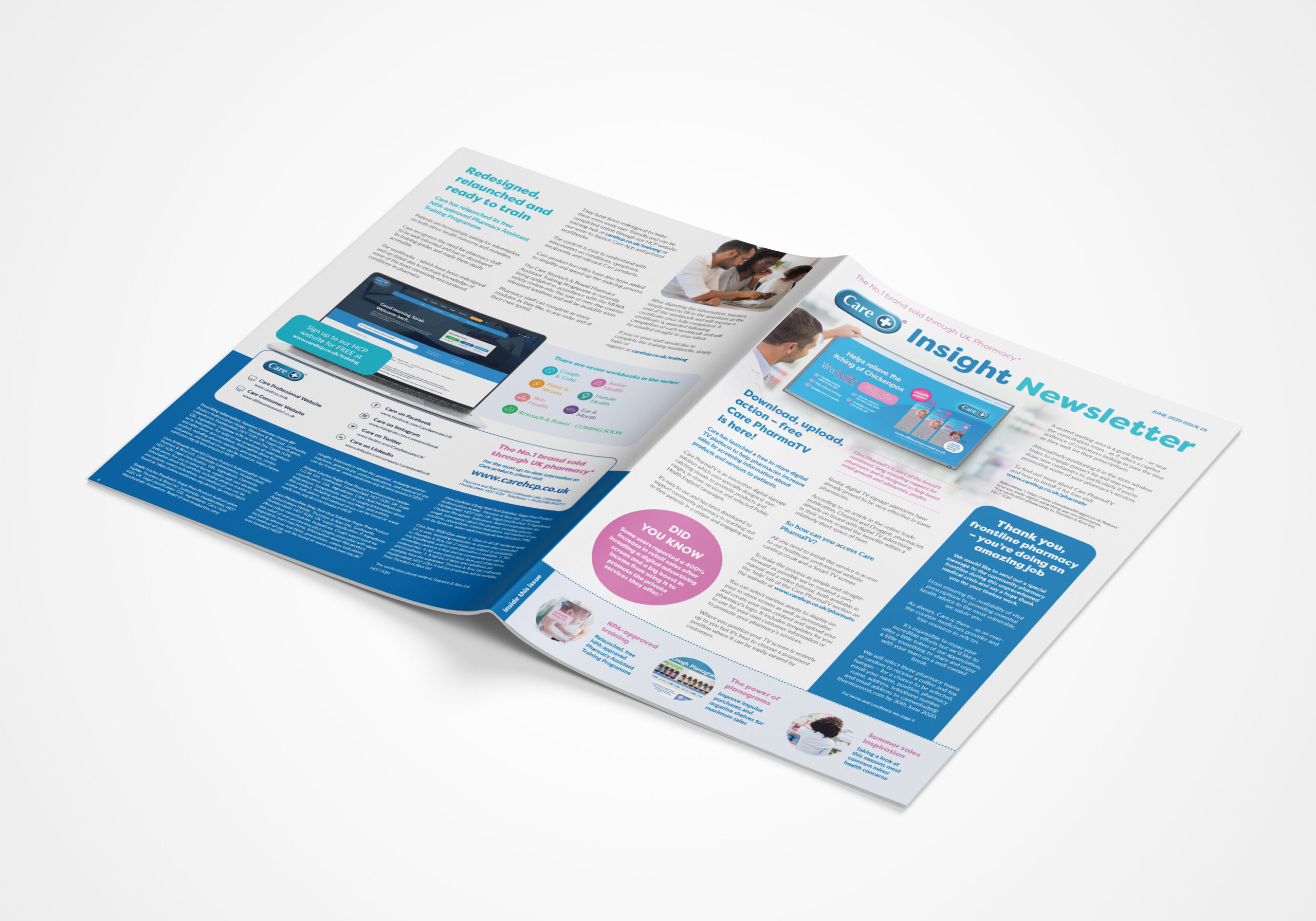
Our digital innovation commenced with a bespoke built HCP (healthcare professional) website and healthcare learning portal, which offered in-depth search functionality as well as placing information about Care products, free training, patient self-treatment advice, industry insights, retail expertise and POS ordering at the fingertips of pharmacy.
Following a successful launch with users signing up from across the UK, we recently expanded the site to develop an innovative and uniquely free in-store digital signage service for Care’s pharmacy customers.
The custom-built TV platform allows UK pharmacies to sign up and access Care’s TV software to display digital messaging – including product placement visuals and selected Public Health England campaigns – in their stores through the use of WIFI and Smart TV technology.
Providing true support through valuable training and personal development
Care’s ethos is simple. To support pharmacy in any way it can, including through the provision of a range of free, expert-developed resources.
It’s continued to do this throughout its existence, but Care has now dramatically increased its offering and embraced digital formats to fit the needs of modern-day pharmacy.
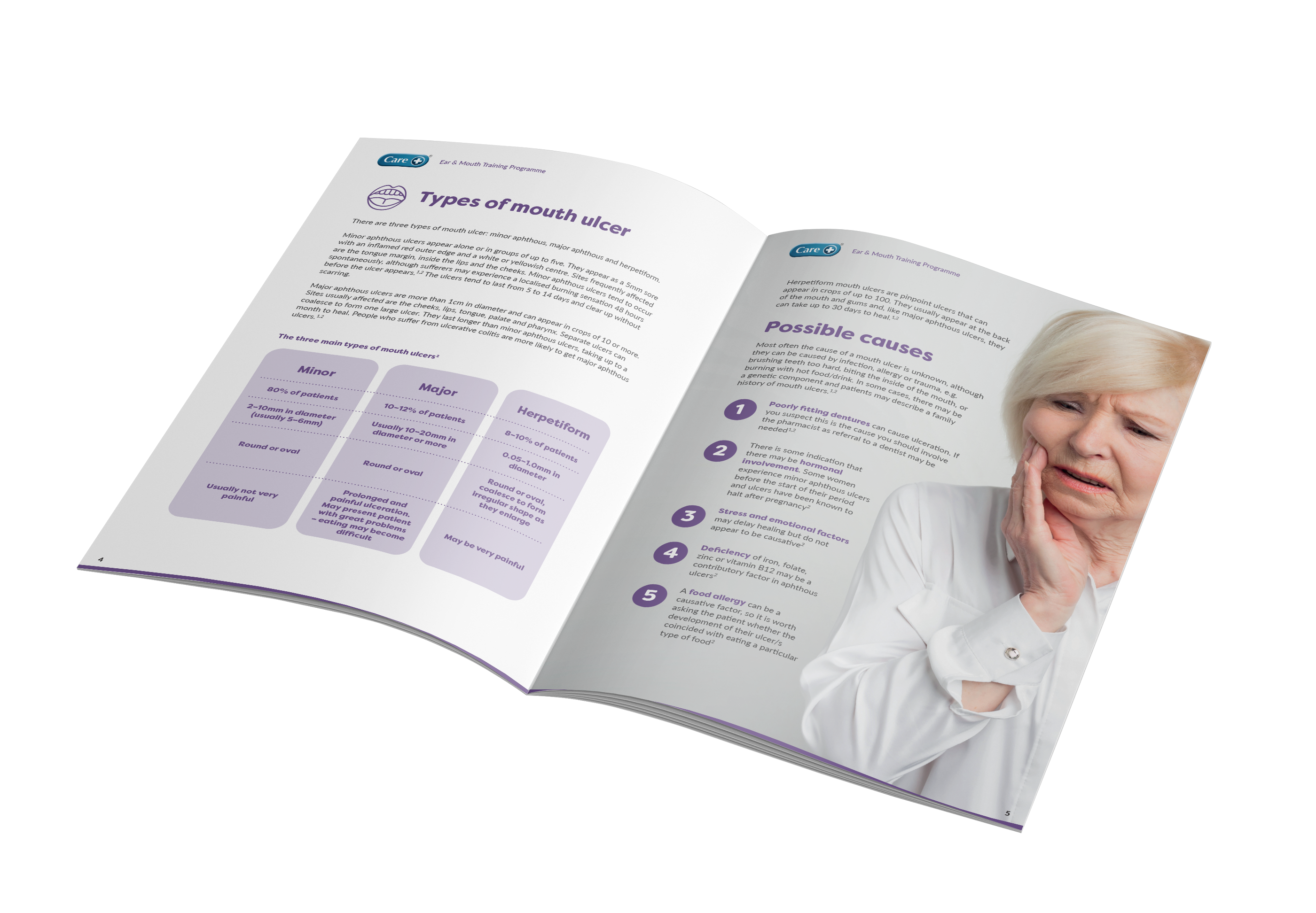
Cornerstone’s head of creative oversaw the redesign of Care’s Pharmacy Assistant Training Programme which offers vital learning on a variety of conditions commonly encountered in pharmacy.
As well as revamping the design of their printed training guides to fit with Care’s contemporary vision, we digitally enhanced the training to make it easily accessible on the new HCP website’s learning portal.
With increasing pressure on pharmacy staff to provide an even wider range of help and advice to patients, providing access to high quality learning is essential.
Cornerstone’s redesign and electronic modification means Care is now in a prime position to provide this valuable resource, via both traditional print versions and its online training portal.
Care’s training is optimised to enable staff to stay fully up to speed and compliant with pharmacy and patient requirements, whenever and wherever they choose.
Care now and in future
The relationship between Cornerstone and Care continued to evolve.
We’re always hungry to be briefed on our next project as well as conceive and conceptualise bright new strategies and solutions to help Care to continue to achieve its marketing-leading objectives.
Cornerstone’s PR, design and digital teams collaborated with Care on a number of on-going campaigns.
We helped to further develop innovative new digital marketing services, PR and sponsorship opportunities, trade engagement, consumer product awareness and meaningful partnerships to help boost the brand to its rightful position within the marketplace.
Care and its products are there to provide TLC – we’d like to think we did the same for a great British brand to be proud of.
* For verification, please write to Thornton & Ross HD7 5QH.
Our Work
R4GM
A green rebrand development driving greater good
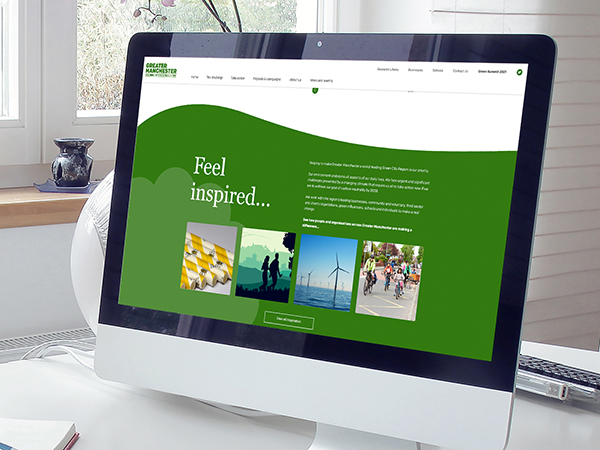
Recycling plays a huge part in helping to tackle climate change and the significance of this rebrand and new website build certainly wasn’t wasted on us.
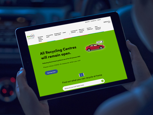
With overall responsibility for the ‘greater’ region’s waste recycling, Recycle for Greater Manchester (R4GM) works with local authorities to inspire and encourage people to waste less and recycle more.
Following a successful pitch, we were given the green light to create a full rebrand and develop a new website for R4GM under the direction of its governing organisation Greater Manchester Waste Disposal Authority (GMWDA).
This was a rebrand that required real consideration and conceptualization – not a mention a little recycling on our behalf…
Making a positive impact
There’s no doubt recycling is an easy, everyday way for us to have a positive impact on the world.
R4GM’s role is to convey this positive messaging through education and engagement, helping residents to see waste as a valuable resource to help conserve and preserve the planet.
The R4GM branding is essential to its on-going campaign visibility and therefore there were many factors to consider during the design process.
We were tasked with creating a strong brand family.
But that family consists of ‘brands’ already established in their own right – nine Greater Manchester councils.
Each reflects its different key target audiences and the areas they operate in.
The challenge was to incorporate all these individual branding elements to create a new look and feel without deviating too far from R4GM’s existing logo, the widely recognised recycling ‘swoosh’ symbol – that’s where our recycling came in.
We designed a range of logo creative to kick off the project with refinement options to satisfy the core branding requirements.
We pitched these to the client and the selection process began.
The chosen design combined the representative colours of R4GM’s council partners in a format which echoed the shape of the recycling swoosh.
We used focus groups to carry out consumer perception exercises which resulted in tweaks to the final design before R4GM welcomed its new brand family with open arms.
Engaging and effective
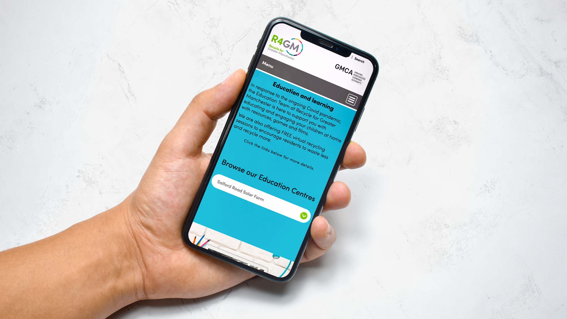
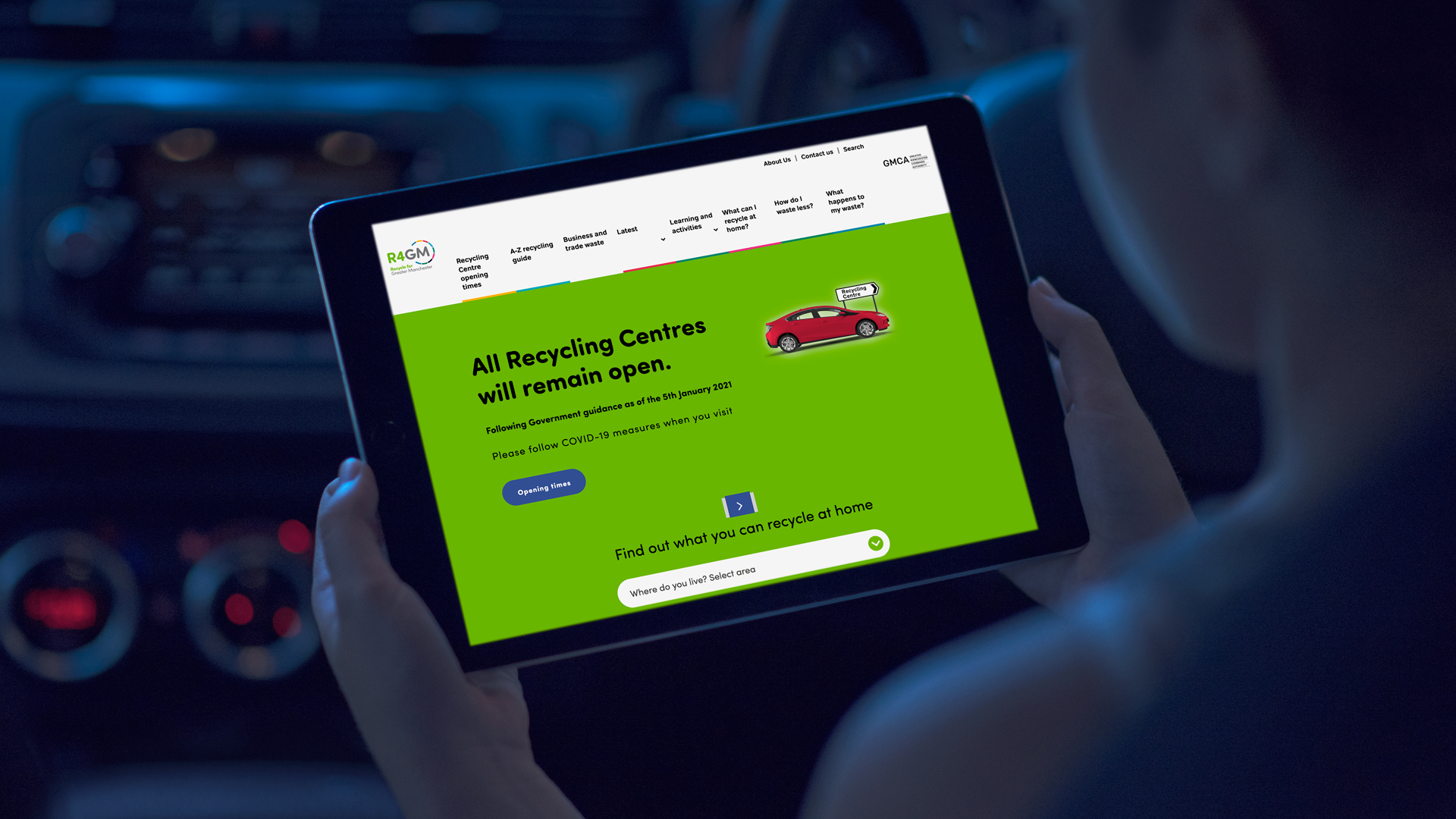
We were briefed to develop a highly bespoke website which required a substantial user focus alongside a carefully considered user experience (UX) design.
First and foremost, it needed to be consumer friendly as the public-facing arm of the brand family, conveying key information in the simplest way possible.
The website needed to strike a fine balance; visually appealing while effectively and efficiently communicating the organisation’s crucial messaging.
Research revealed that the majority of visitors accessed the site via Google searches meaning they frequently landed on a range of pages rather than initially seeing the homepage.
Therefore, the website needed to have a cohesive look and feel throughout, pushing strategic calls to action across several of its key pages.
With UX at the forefront we developed a site with well-structured content and information accompanied by a range of touchpoints to highlight the main messaging elements.
Illustrations play a significant part in the design, helping to engage and achieve the brief’s behaviour change objectives.
The website continues to have a hugely positive impact on R4GM’s goals and waste reduction ambitions – driving a change in attitudes and actions to equal genuine environmental effect within its communities and beyond.
Working with us
We’re an ethical, reputable, integrated agency providing results driven B2B and B2C projects and campaigns to our clients across a wide range of sectors and industries.
Our expertise spans all marketing disciplines including strategy and research, public relations, design, digital marketing, print production and signage.
To find out more about working with us email clients@cornerstonedm.co.uk
You can keep up to speed with our latest client work and industry insights by connecting with Cornerstone Design & Marketing on LinkedIn.
Our Work
Glo Gym
Gym brand’s glo-ing testament sets tone for strong partnership
When the new gym kid on the health and fitness block first flexed its muscles in Oldham, it chose Cornerstone’s leisure marketing team to strategically partner the venture.
Several years later, that Glo Gym partnership goes from strength to strength – in fact you could say we’ve ‘glo-n’ up together.
Glo Gym was a much-anticipated arrival at Oldham Athletic Football Club’s newly built North Stand.
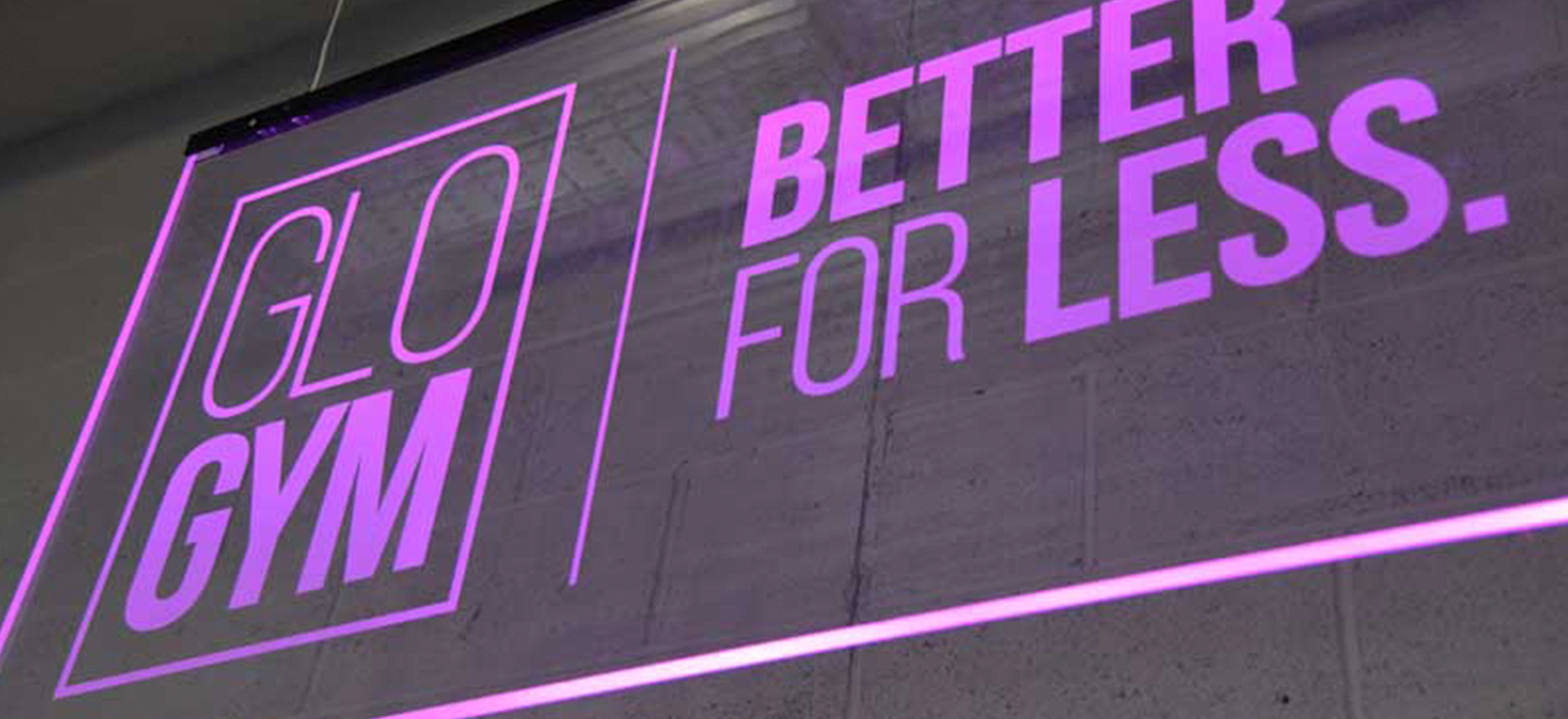
The facility opened in 2016, boasting a state-of-the-art 150 station gym and 220 square metre fitness studio.
It was a fast mover on the fitness scene, but its branding identity and online strategy needed to pick up the pace.
That’s where we came into play.
Cornerstone was quickly tasked with developing Glo Gym’s overall marketing strategy from scratch, including its digital presence, a new website development and the venue’s impending pre-launch build-up.
The rest, as they say, is history.
Things have worked out very well but that isn’t the end of the story.
It’s just the beginning and we’d like to tell you how we’ve helped Glo Gym to pump up the volume and raise the marketing bar to become one of Oldham’s most successful health and fitness settings…
Pitching it right
As with all great campaigns it started with a brief – and due to the momentum of the project, a pitch followed hot on its heels.
We designed and developed a new look and feel for the brand across its core marketing assets – website, marketing campaign and social media ahead of the imminent opening.
With just days to spare, the Cornerstone team worked through the night to hit the website launch deadline, including the integration of its third-party membership booking system named membr.
After hitting the ground running the result was a visually striking, engaging and easily navigable website, fully optimised for mobile devices.
This incredible turnaround paved the way for a relationship which continues to go from strength to strength through our full service offering of ongoing marketing support, social media marketing, design, signage and print production.
Strategy with core strength
This was based on a firm understanding of their proposition, USPs and target audiences to develop a two-pronged marketing strategy.
It centred around attracting new members by resonating with those seeking a motivating and energising environment in which to challenge themselves.
We also focused on retaining existing members through messaging designed to reflect Glo Gym’s sense of community, belonging and camaraderie with the aim of uniting the forces of the Glo Gym team spirit.
The marketing strategy provides an integrated, multi-channel approach with a consistent and compelling proposition to both target audiences
A social media strategy was formed to attract and retain members through engaging content to add value through advice and tips, motivation, entertainment and an opportunity to engage in conversation with followers.
Through well-considered PPC planning we work to attract new members by effectively communicating Glo Gym’s proposition to target audiences based on demographics, lookalike audiences and remarketing to warm leads which previously engaged with the website or related sites.
The membership campaigns employ eye-catching visual aesthetics and compelling messaging.
Imagery always features Glo Gym members – not models! – to ensure our comms continue to resonate and portray the authencity of the brand’s ethos.
We built social media from the ground up, so the audiences currently stand at:
- Facebook: 2,366 with average monthly reach of 72,500
- Twitter: 784
- Insta: 1,300 with average monthly reach of 10,083
Average monthly engagement:
- Facebook: 1%
- Twitter: 60% (based on the number of likes and retweets divided by number of tweets – not an exact science…)
- Insta: 4.5%
Helping Glo get that Black Friday feeling
Black Friday is a popular way for the leisure industry to attract new members with some enticing discounts.
We were asked to devise a marketing support strategy to promote Glo Gym’s Black Friday sale.
Cornerstone researched the market, identified key targets and opportunities and pulled together a multi-channel Pay Per Click & Paid Social approach to utilise platforms such Google Ads, Bing, Facebook Ads, Twitter and Instagram.
What was planned as a three-day campaign proved so successful it was extended over the next 10 days, gaining 200 new members during the initial period alone to generate an ROI of over 1,400%.
The influx helped Glo Gym exceed all previous sales for a single weekend and went on to seed ongoing loyal membership.
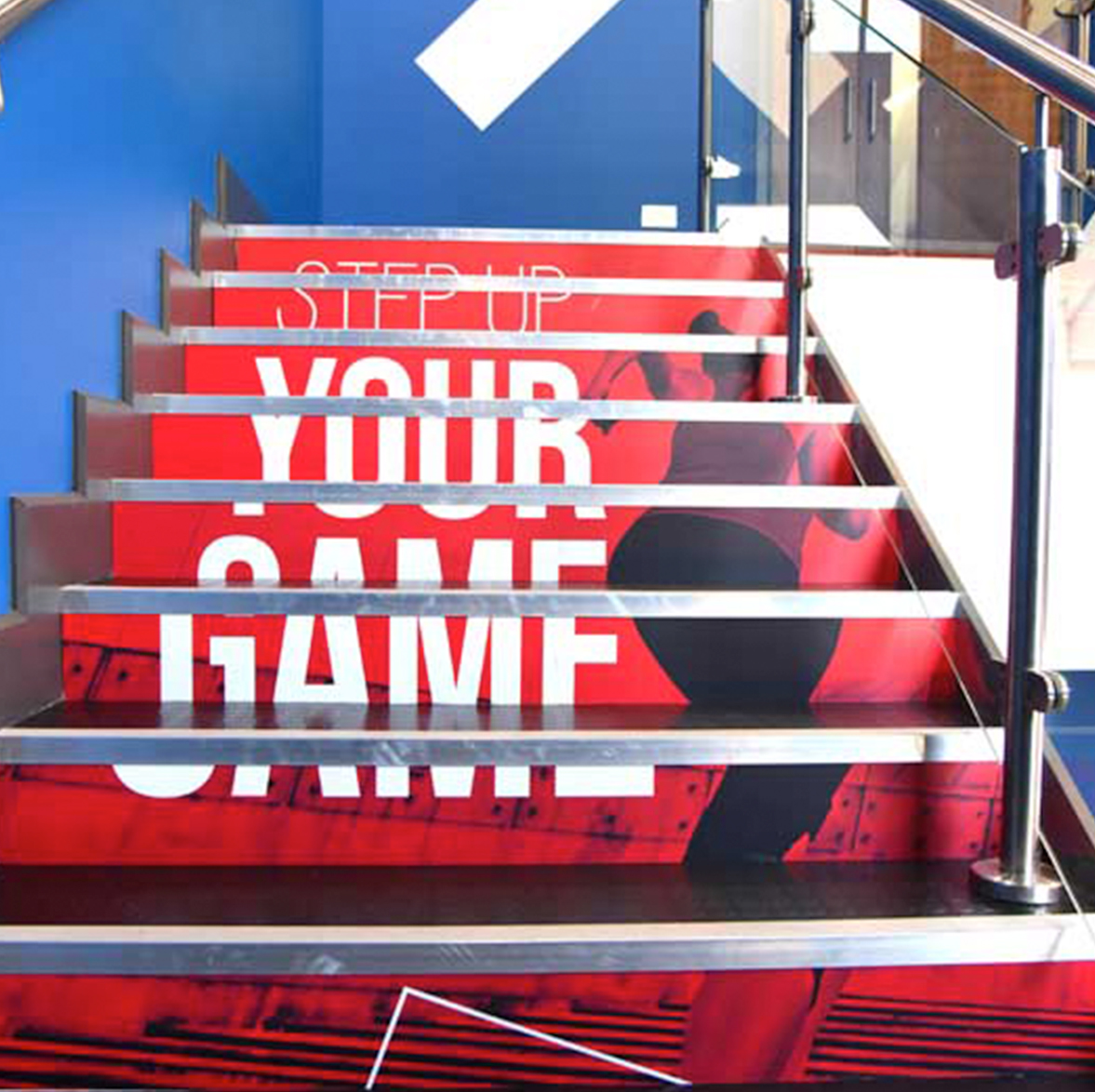
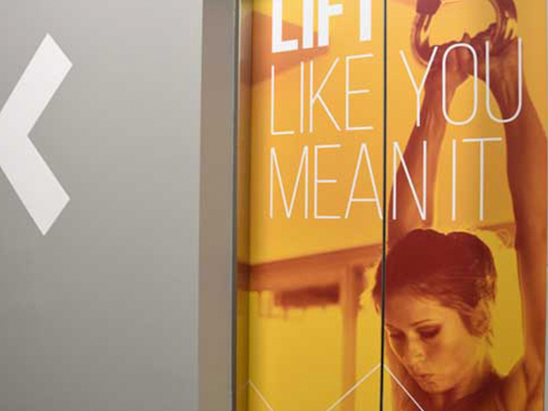
Conceiving an interior design to bring a blank canvas to life, while replicating the look and feel through cohesive exterior signage (and within an extremely tight timescale!) is no mean feat.
It takes real vision and conceptual skill – which is convenient as Cornerstone’s design and production departments have plenty of both.
A key part of the brief was to create something unique, engaging and visually strong, helping to build both brand value and positive consumer perceptions of the gym operator.
The concept needed real impact to showcase the newly launched Glo Gym to a crowd of potential new members during an open weekend.
Our designer Dave has worked on Glo Gym’s branding from the get-go.
So who better to explain his conceptual design genius!
“We started with a blank canvas and even began work on the install while the construction crews were still on site.
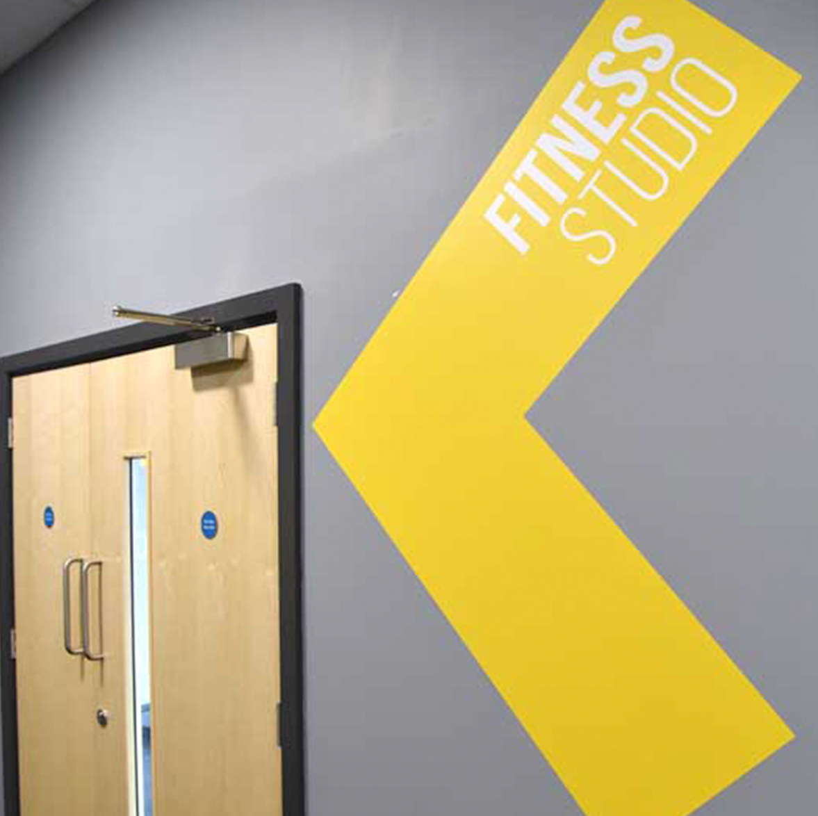
“An initial walkthrough with the client weeks earlier allowed us to pinpoint the required signage and graphics throughout the gym.
“The brief was flexible with the only requirement being bold and bright, utilising the pre-existing colour palette.
“The visual was very much based on ‘motivation’ and a sense of ‘movement’ and created to reflect the website and promotional artwork.
“We used a duo-tone colour effect on a series of lifestyle workout images to create the large window graphics to the front of the site. Internally, large chevrons and typography were created to direct you through the gym with motivational quotes along the way.
“The largest element of the internal graphics was a full wrap to the spin studio to add to the immersive atmosphere. It took a full week to install.”
The resulting design hit all the objectives – bold imagery and stand-out graphic elements throughout to create a streamlined customer experience and empowering workout environment.
It involved the installation of custom printed lift vinyls, printed stair tread graphics, external illuminated signage, exterior window vinyls, interior signage, wall vinyls, vinyl cut lettering, acrylic signage and notice boards, and lightboxes – just a few components that went into this huge project.
Thanks to two weeks of 24/7 vinyl printing at our production studio, we delivered the installation on time and on point.
Both the client and the construction team we collaborated with on the project were truly glowing about the design, process and high standard of finish – to the extent that Cornerstone became the favoured supplier for both companies.
The leisure industry has been a core sector for Cornerstone Marketing and Design for well over a decade.
We operate as strategic partners and as an extension to clients’ existing in-house teams through our comprehensive offering of expertise across marketing, public relations, design, digital marketing and production.
We specialise in developing effective, results driven marketing strategies for UK leisure trusts which are specifically designed to help them compete with the industry’s larger national players.
From marketing research and strategy, through to re-brands, marketing audits, creative comms, PR, videography services, PPC and signage, we’ve helped develop marketing campaigns that not only engage with audiences and convert them into members but bring retention and long-term loyalty.
We’re here to help you make your marketing activities work harder and achieve optimal performance from your existing efforts and investment.
Email us at clients@cornerstonedm.co.uk
You can keep in the loop with our client work and latest industry insights by connecting with Cornerstone Design & Marketing on LinkedIn.
Our Work
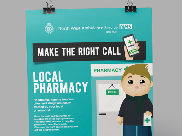
NWAS ‘Make the Right Call’
Changing behaviour to ease NHS pressures
Healthcare and NHS marketing campaigns are always a highly rewarding aspect of the work we do.
It’s an opportunity to pour our heart, soul and creative minds into a project which has real impact on the organisations we work with and a much wider social impact on the communities they serve.
When we collaborated with North West Ambulance Service (NWAS) on their ‘Make the Right Call’ initiative it was part of a much bigger picture to ease the mounting seasonal pressures on our wonderful NHS marketing services.
Developed to support a national NHS winter campaign, it was designed to help spread key messaging to the public when it comes to making the right healthcare choices during times of ill health.
Delivering awareness was our focus
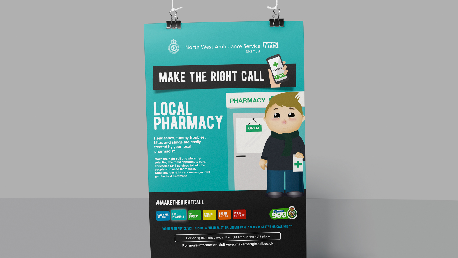
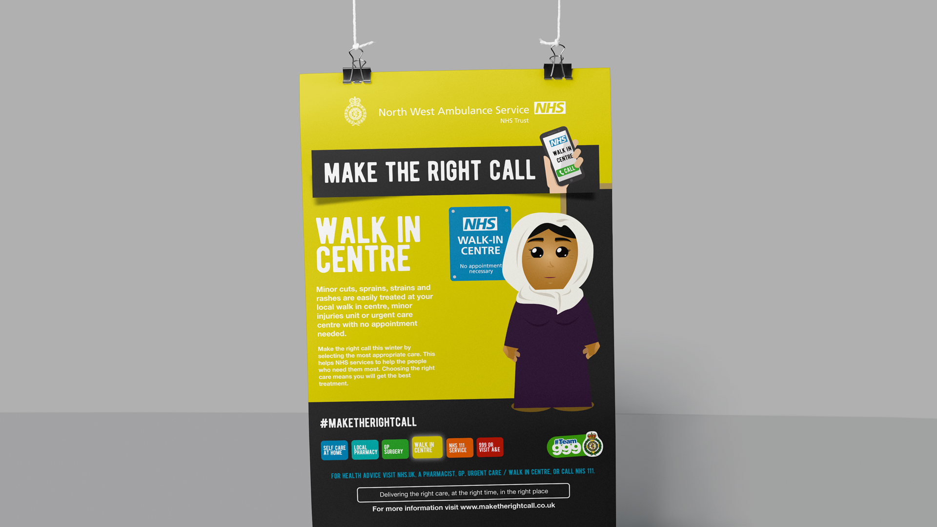
It focussed on delivering awareness that while dialling 999 may seem an easy option, unless it’s a life-threatening emergency there are more appropriate choices ranging from self-treating minor ailments to pharmacists, GP’s, walk-in centres and NHS 111.
The core aspect was alerting people to the fact that using A&E or 999 for non-emergencies could take essential help away from someone who really needs it.
With the aim of raising awareness, educating and informing the region’s residents, we were briefed to create an engaging digital campaign alongside promotional literature design for GPs surgeries and outdoor banners to sit outside NWAS stations.
As we’ve partnered with NWAS on a number of projects over the years, it didn’t take us long to make the right call when it came to forming the foundations of an original and engaging campaign.
And not only did it succeed in resonating with the north west population, it also secured a gold accolade in the Healthcare Campaign category of the Chartered Institute of Public Relations’ 2019 North West PRide Awards – the UK’s most prestigious nationwide awards scheme recognising excellence in public relations and communications.
Want to know more? Read on!
Concepts, tactics, creativity and innovation
When it comes to changing behaviour, tone and messaging are crucial.
After all you want your audience to feel involved, engaged and motivated in the decision-making process.
With that in mind we extended an original messaging idea, which was simply ‘Right Call’, to ‘Make the Right Call’.
This informed the public there was actually a decision to be made and with the right information they could make the right choice for themselves.
With the headline and theme in place, we were able to tie in a cross-channel social media hashtag (#MakeTheRightCall).
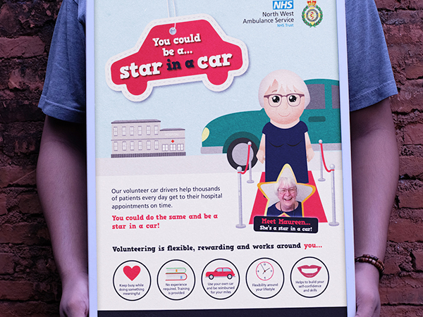
We then welcomed back NWAS’s much-loved family of cartoon characters which had won the public’s affection during previous campaigns.
Creative calling
Our designers worked on creating a visual guide to help signpost people to the right service according to their symptoms.
Based on a thermometer with self care at the bottom rising to A&E or 999 at the top of the scale, it was colour-coded to reflect temperature, i.e., blue for colds and sore throats which can be self-treated through to red for chest pains and breathing problems to signify an emergency.
Re-introducing the lovable bunch of NWAS characters wasn’t just to strike a chord with the audience, it also ensured brand consistency across the organisation’s public-facing comms.
Norman, Carol, Suneta, James, Eileen and Phil quickly made a name for themselves in a patient stories animation which we rolled out across social media, the NWAS website and on YouTube.
They also popped up in a series of posters which drew the thermometer visual guide colours into the background to help the public understand the different routes to care.
These were designed to be displayed in GP surgeries and transferred across all marketing collateral including social media, online ads and outdoor banners.
The campaign was also strategically designed to reach out to children as well as their parents, to begin instilling the messaging from an early age.
This was achieved as an additional resource on the ‘Make the Right Call’ microsite – linked to NWAS website – which engaged youngsters by inviting them to colour in one of the cartoon characters and enter it into a competition via social media.
The digital power of persuasion
As this campaign largely hinged on digital elements, we developed a wide-reaching, multi-channel approach for their healthcare marketing campaign. This campaign included social media marketing, PPC and email marketing to NWAS members and CCGs in a bid to spread the word through brand advocacy.
We embarked on an intensive social media strategy, distributing up to twice a day across NWAS’s Facebook and Twitter accounts.
Accompanied by the hashtag, we used educational and informative messaging to encourage people to ‘Make the Right Call’ supported by quizzes, competitions and a ‘patient story’ series prompting people to click through to the website to discover the outcome of a medical scenario.
Social media efforts were backed by a PPC and Paid Social campaign to target various audience groups by boosting posts with Facebook Ads and Google Ads.
The microsite was the hub of interaction, fed by social media and signposted across all marketing elements.
It was designed to be visually engaging featuring an inbuilt online service finder to assist the care decision-making process and it was optimised to be accessible across mobile, tablet and desktop devices.
Healthy results
The campaign ran for three months and during that time the ‘Make the Right Call’ microsite attracted 2,806 page views, drawing in visitors from every corner of the north west.
Social media achieved incredible results, reaching well over half a million people organically and 267,890 people through paid advertising.
It referred 420 sessions to the microsite and attracted 22,238 new Facebook likes.
The video animation reached almost 267,900 people and received 187,616 views. Norman, Carol, Suneta, James, Eileen and Phil were catapulted to fame!
The awareness impact of this campaign was undoubtably instrumental in helping thousands of people to make the right health care choices and consequently free up the emergency services of NWAS and the NHS for those who really need them.
If you’re looking to make the right call on your marketing activities, get in touch.
As a full service marketing agency incorporating design, digital marketing, PR, print production and signage we offer our areas of expertise under strategic partnerships or to compliment the skillsets of in-house teams.
We’re renowned for our strategic and creative approach to achieve efficient, engaging and results-driven outcomes.
To find out more email us at clients@cornerstonedm.co.uk
Keep up to date with our client work and latest industry insights by connecting with Cornerstone Design & Marketing on LinkedIn.
Our Work
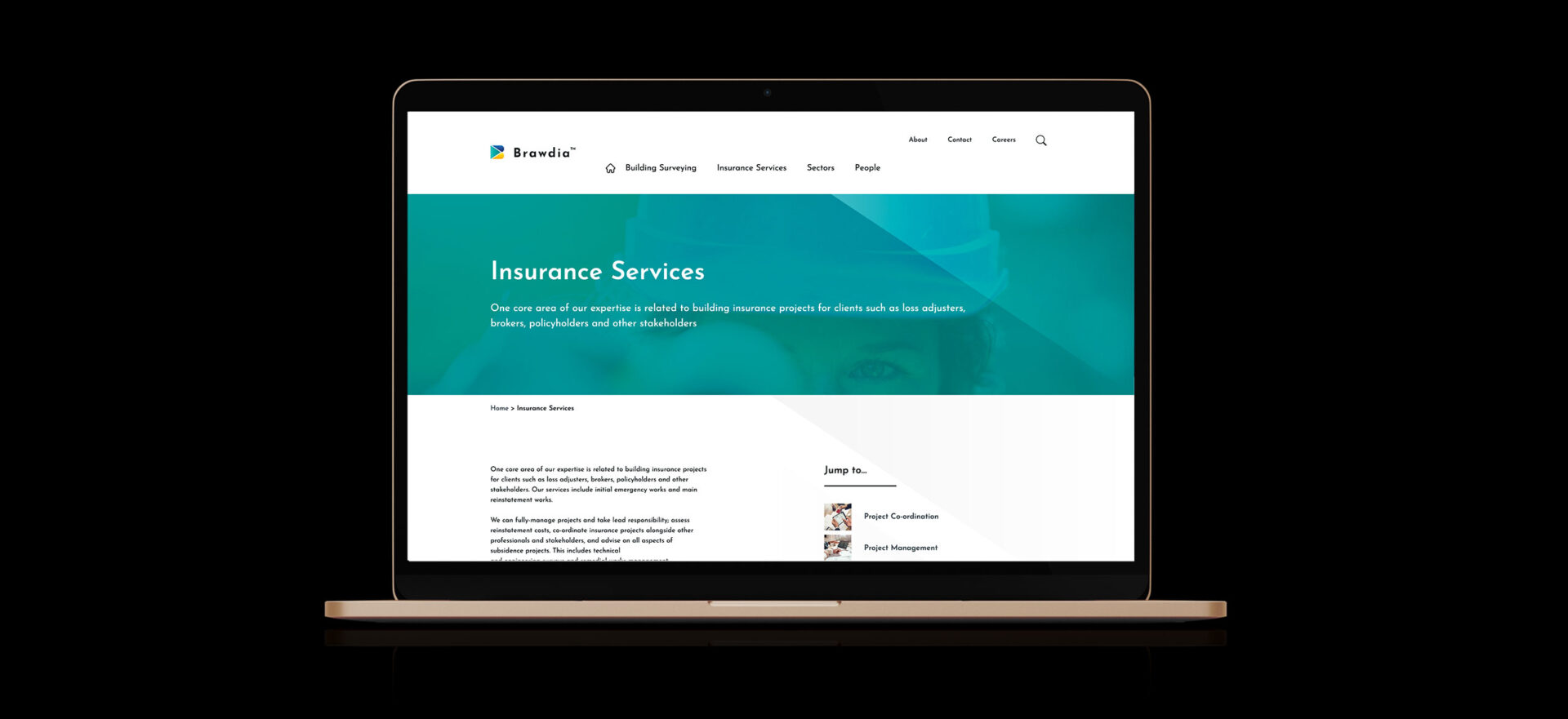
Brawdia
We launched a brand-new company into the UK property and construction sector
We helped a brand-new company launch into the UK property and construction sector – and also primed it for wider global markets and growth. The fascinating journey included complex considerations and global conversations with multiple stakeholders, working to a tight deadline. But our resulting branding project, visual and written assets and purpose-built, optimised website created a perfect launch.
Property and construction industries are key sectors of the economy – cornerstones you might say – and are sectors that we love to support with our full-service offering.
The property world is also diverse with multiple types of organisations and audiences. It includes small and large companies, professions, trades, chartered institutes, and brands.
Helping a client to launch a new property business and creating and positioning a new brand into the market is a fascinating challenge. Ensuring the new brand and assets are suited for both UK and global markets, including trademarks and domain registrations, adds yet another dimension.
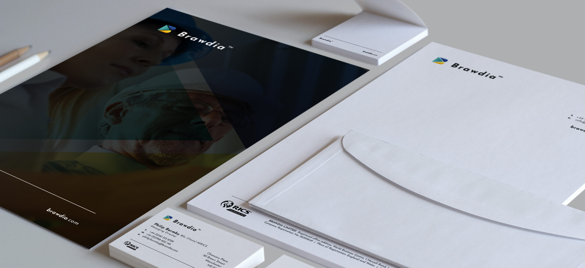
But rising to multiple challenges with our specialist in-house teams are among the distinctive characteristics of our agency. We did exactly this for Brawdia, a new building and construction consultancy with stakeholders in the UK and United States. Brawdia specialises in insurance-related surveying services for commercial property clients and we supported it with a full-service rebrand and launch.
We developed branding, a logo, strapline and tone-of-voice guidance to guide Brawdia’s marketing and communications. In addition, we developed and designed its website and created written content to clearly convey its services to appeal to its target audiences.
A new name led by industry stalwarts
Brawdia has UK bases in Manchester and London, along with a range of international stakeholders and ambitions to grow globally. The company name, pronounced ‘Braw-deeah’, comes from old Scottish and Latin languages. It roughly translates into ‘excellence every day’.
The new consultancy has a team of RICS-registered surveyors with deep experience and expertise of technical surveying for commercial and residential property stakeholders and property insurance professionals who face diverse challenges or risks with buildings and land. They serve clients including property owners, developers, financers and insurance professionals such as loss adjustors.
Expanding a brand worldwide
Driven directly through referral, we came recommended because Brawdia aimed to overcome the challenge of creating and positioning their new brand within the UK market, with a view to ensuring it was expandable worldwide.
Our agency’s managing director, David, led the project which involved detailed, complex discussions and considerations as part of the process, with marketing strategy underpinning our service offering. As part of our strategic work, we facilitated detailed input and feedback from various stakeholders at Brawdia, in the UK and overseas. This was then distilled into meaningful commercial outcomes covering the new brand and other elements of the project.
We held a branding workshop to fully understand and interpret the thoughts, feelings and insights from directors in the UK and United States regarding the brand, marketplace and target audiences.
There were a number of naming options suggested and preferred by stakeholders. Our task was to verify, validate and consider the impact of each within the market, in the UK and globally. This meant working with the client’s legal teams on trademarking and domain registrations.
Following a brand facilitation workshop, we formed a branding proposal document with key combinations or variations of the names discussed, with the end result being Brawdia.
Vision, mission and value statements for the new consultancy were also formed and proposed. Once approved, these were migrated into a brand guidelines document and developed by our creative design team for a unique visual identity.
Visual work had to echo the values and vision of the new business and align with objectives outlined by all key Brawdia stakeholders to ensure long-term success. The brand was developed over a number of weeks and integrated into a variety of literature and digital assets.
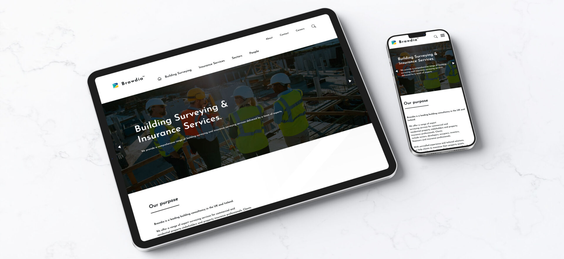
Website workshop
Alongside the branding exercise, we developed a new website for Brawdia, providing the design, development, content creation and search engine optimisation (SEO). The website was designed with lead-generation campaigns, brand awareness and digital activity in mind. It forms a strong foundation for the client’s marketing activity moving forward.
In the UX workshop with the client’s management teams in the UK and United States, we discussed objectives, user personas, convincers and enablers that were needed on the website. We also conducted a website design benchmarking exercise, looking at other websites that the team liked for consideration and inspiration. When looking at website structure, we used an online collaborative tool to replicate using sticky paper notes in a physical meeting, which added a little bit of fun too. You can view their new website here.
Written content was produced by our PR team, which included introductory summaries and in-depth details of Brawdia’s surveying services.
The tone-of-voice and brand message were key considerations in this project, especially because this was a new business. Everything had to communicate trust and expertise along with Brawdia being a pioneer in its field.
The whole Brawdia project faced a tight timescale to achieve pre-agreed launch dates. But we completed the various phases in good time before each deadline. It was the icing on the cake.
Brawdia had all the design and marketing requirements ready for launch and we look forward to watching its development and hope to continue our work together as it grows.
Benefits of a full-service solution
Our agency’s full-service offering differentiates us from others and gives us an edge when it comes to delivering high quality performance in a streamlined and efficient manner.
Like Brawdia, we aim to deliver excellence every day too.
Whether you’re launching a brand-new venture or want to grow an existing business, get in touch to discuss the many ways we can help. Email: clients@cornerstonedm.co.uk.
Our Work
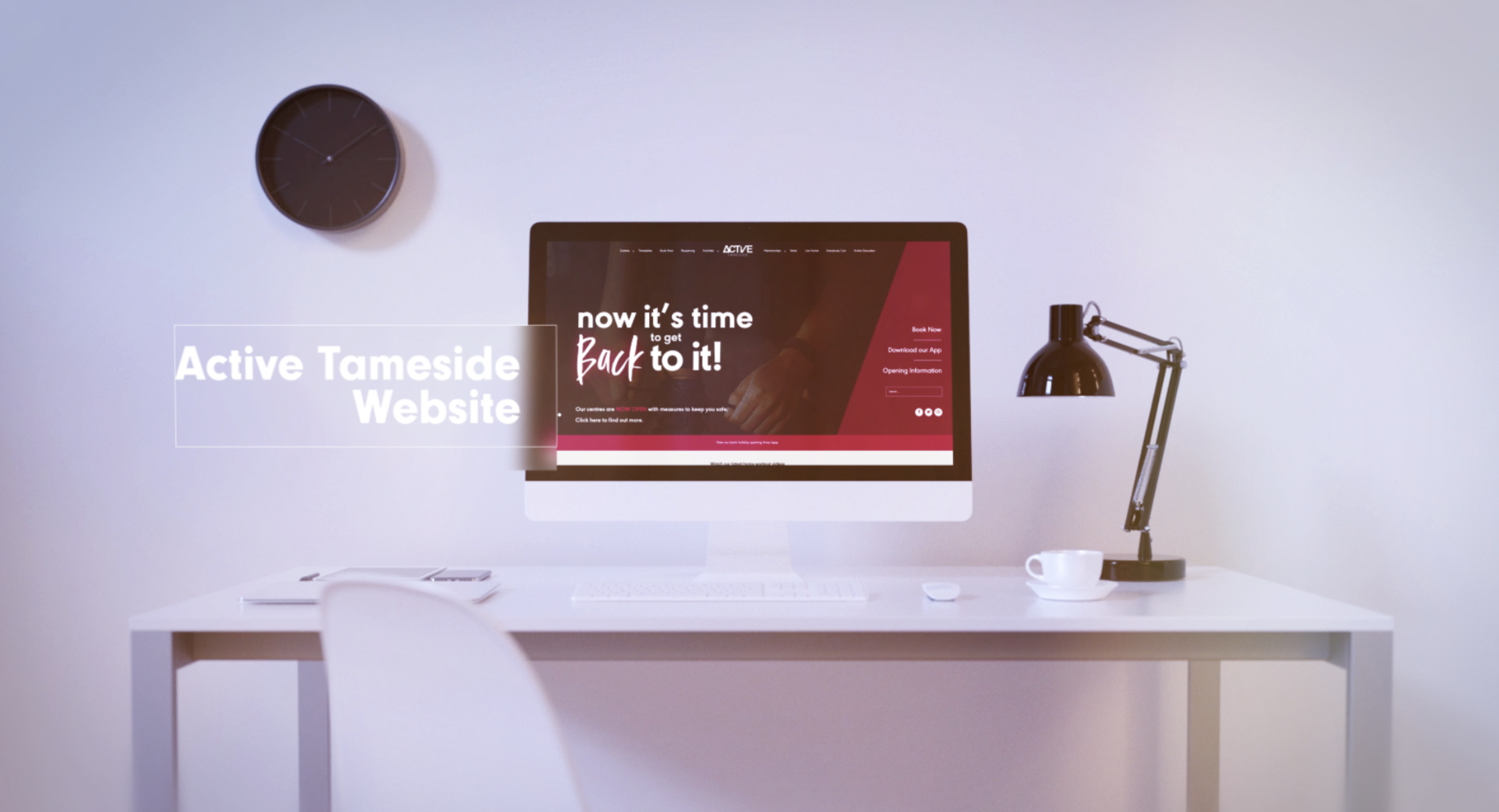
Active Tameside
Unified branding that gives all the right trust signals
You’ve heard the phrase ‘Great oaks from little acorns grow’?
Well, our collaboration with one of Greater Manchester’s largest leisure trusts was along those lines.
Active Tameside operates leisure centres, children’s attractions and community schemes throughout its metropolitan borough.
The trust initially approached us for a website development.
But once we’d unearthed the breadth and depth of its structure and offering, we knew there was so much more we could do to elevate and differentiate this caring and supportive not-for-profit charitable organisation.
That’s when the green shoots of a full-service partnership began to sprout…
A branding workout
Gyms are gyms.
But leisure trusts are so much more, providing huge value to the communities they serve and making a genuine difference to the lives of many.
Active Tameside provides accessible, high quality gyms, swimming pools, sports facilities and leisure activities as well as highly valuable services through the provision of primary school PE programmes, a GP referral scheme, outreach services to people with learning and physical disabilities and much more.
The trust’s offering had expanded and evolved over the years and consequently it’s branding identity had failed to keep up.
There was a lack of logo consistency and cohesive branding between its services and attractions.
And that was causing problems for cross-selling to its other offerings.
There was a barrier to clarity and awareness that these offerings were even run by the trust.
For example, health and fitness members were unlikely to know there were also children’s attractions they could take their families to.
A branding workshop got things on track; we established a branded house approach for all the different services and a multi-channel comms strategy which would seamlessly umbrella the organisation and define its position as a hub of health, fitness and wellbeing.
We created a tone of voice to help it project its caring, supportive and accessible-to-all ethos and values throughout all its communications.
The acorn
Granted, it’s big acorn but the new website planted the seed of a strategic partnership which continues to flourish and branch out.
Active Tameside were looking for a complete redesign of their WordPress website to improve usability, provide more cohesion between their various venues, generate better brand positioning, boost speed and bolster security.
We designed and developed the new site on a bespoke built framework, putting UX at its heart.
This involved reworking the sitemap structure, designing over 20 webpage formats, and streamlining the process of searching, booking and paying through their website via complex API integrations with back office systems.
We identified three main calls-to-action from existing users’ habits and highlighted these on the website to drive enquiries and sales.
To unify their venues, we drew in data from Active Tameside’s various centres into the main website, uniquely introducing a way to connect all 10 sites under one website roof.
This allowed staff from all locations to use one simple system to add classes and manage members, which would automatically update various pages of the website, cutting down their administration time and hosting and web maintenance fees.
The website includes intuitive flourishes such as accordions to display depth of information succinctly, filter systems, plus a careers page with a filter system and text memory.
After launching in September 2018, Active Tameside gained huge online traction, improving web sessions by 11% and pages per session by 29%.
The finished product and refined branding helped to give the trust a strong and unified presence to rival its commercial competitors.
Socially not awkward
Social media is a key marketing tool for leisure operators and presents them great opportunities to reach out and engage with members and customers and showcase its offerings.
We focussed on renewed efforts across Active Tameside’s social channels and thanks to lively, entertaining and informative content, audience and engagement quickly grew to create an invested digital community.
- There was a 51% rise in web sessions via social media and a 15% increase in pages visited per session.
- Facebook engagement increased by 87% with a healthy 16% of these being shares, showing that Active Tameside’s content continues to reach wider audiences.
- Facebook reach has also risen significantly by 265% since paid adverts were introduced, with the top post reaching 4,674 people with 266 clicks.
These significant results exemplify how a unified brand across marketing activities can strengthen consumer perceptions and ultimately improve brand engagement.
The oak
From all of the above a marketing retainer grew. We now provide Active Tameside with a comprehensive range of marketing services through a monthly retainer.
It includes marketing strategy, social media marketing, PR and copywriting, design, email marketing, regular multi-channel campaigns, digital reporting and web maintenance – all within one neat and tidy retainer package overseen by a dedicated account manager.
And let’s not forget our production department.
The re-brand was also an opportunity for Active Tameside to take advantage of our in-house print service which designed, produced and installed new signage across all its centres including bold and eye-catching internal graphics for the brand-new Tameside Wellness Centre bowling attraction.
When venues reopened following the first wave of the pandemic we designed and produced its in-centre safety signage within the tightest deadlines.
We’ve also created high quality videos for its annual reports and to promote its community outreach services as well as in-centre photography.
You get the picture.
We have a reputable and long-established and history of helping leisure trusts across the UK to develop strong and effective marketing strategies, allowing them to compete with larger national players.
To find out about working with us call us on 0161 213 9941 or email us at clients@cornerstonedm.co.uk.
You can keep up to date with our client work and latest industry insights by connecting with Cornerstone Design & Marketing on LinkedIn
Our Work
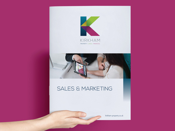
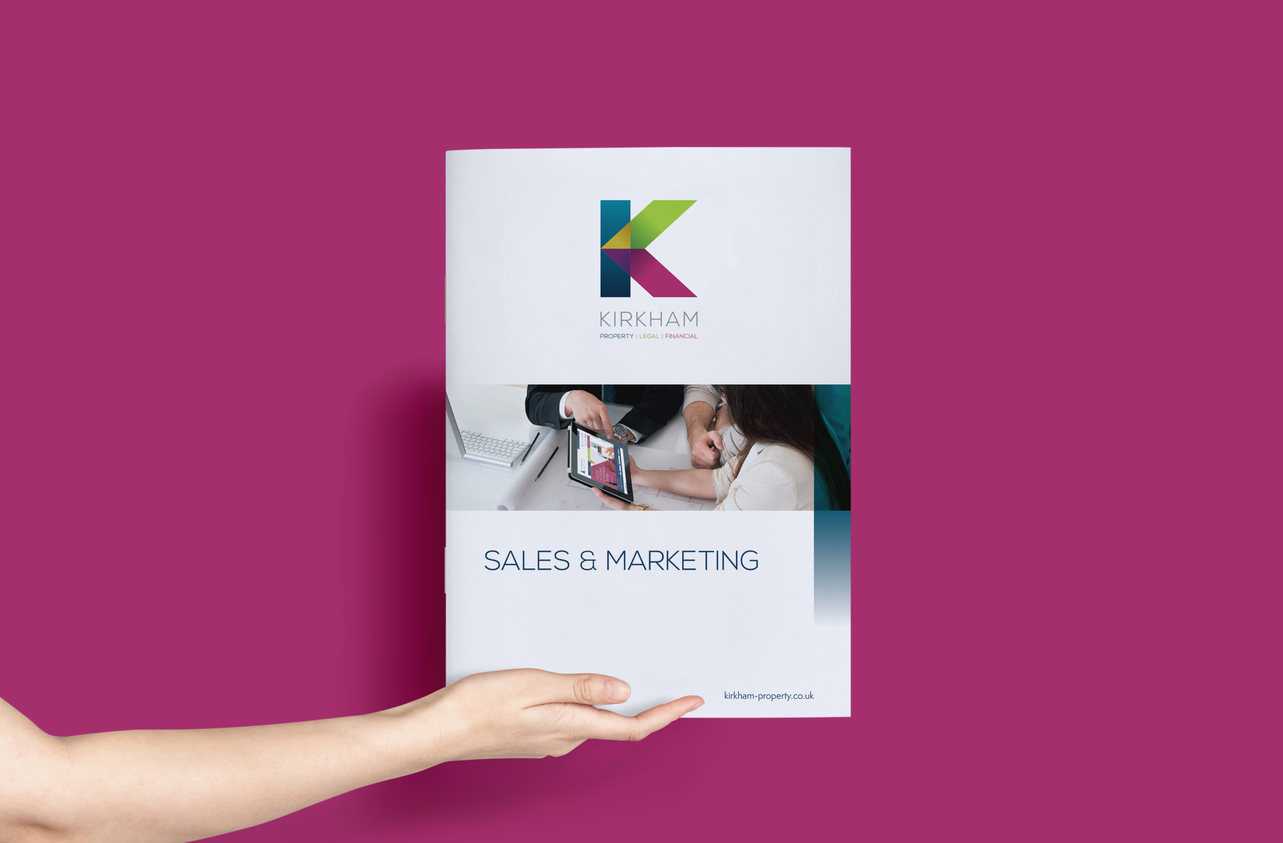
Kirkham
Helping to rebuild an established property brand
Most new client processes begin in a formal fashion and start with a pitch.
But this one was flipped on its head.
The foundations for our collaboration with one of Oldham’s most established and reputable estate agencies, Kirkham Property, were laid on a role reversal.
Building relationships
Our MD David was originally a vendor client of Kirkham Property which had provided a first-class service in securing the sale of his first home.
He’d built a good friendship with now Partner Oliver Gill and during one of their verbal exchanges, discovered Cornerstone could return the favour.
Here’s David to explain.
“We got on well, talked about each other’s businesses and in the face of property market challenges from the emergence of online estate agencies, they knew they needed to change their image, brand identity, digital presence and marketing approach.
“With that in mind, they came to Cornerstone to see what we could do.”
So that’s how we got on the marketing property ladder.
After six years we have not just climbed a few rungs together, we’ve scaled some inspiring heights.
We’ve helped Kirkham Property to reposition and reinvigorate itself as a business, generating a greater brand presence which has ultimately driven sales and shifted consumer perceptions.
And we now also provide marketing support to their sister firms Kirkham Legal and Kirkham Finance. A full house.
So, let’s tell you how, brick by brick…
Rebranding was key
When Kirkham initially walked through the Cornerstone door, first impressions were focussed on their brand identity.
Great branding is essential for a property firm for obvious reasons. It needs to say everything about the business creatively, succinctly and simply.
Kirkham’s historic blocky yellow ‘K’ on a blue background had become outdated.
At the time, the business was called ‘Alan Kirkham’s’ which gave the impression it was a small set-up – not at all reflective of its scale as an established five-office estate agency not only offering property sales, but also commercial, lettings, financial, legal and conveyancing.
Converting a traditional 30-year-old brand to echo its modern-day expertise and offering required both sensitive and intensive strategic thinking.
On one hand the new identity had to slickly project them as real competitors to their online counterparts and showcase their extensive experience and high-end customer service.
On the other it needed to retain Kirkham’s heritage and presence within the geographical market – not to mention holding on to the reputation it’s affectionally known for.
The ‘K’ was always special, so the new look preserved that distinctive element.
The concept was based around refreshing the branding, adopting both simplicity and a clean typograph style to provide a truly modern aesthetic.
It drew on three colours to represent each of Kirkham’s three services which would then be replicated across its literature and brochure design, new office signage and website.
We took the bold step of renaming the business Kirkham Property while identifying the core divisions of the business, ‘Property. Legal. Financial’.
We then developed a strapline with purposeful punctuation to highlight these integrated services, values and position statement: All. Together. Better.
It has dual meanings; ‘Together, all the parts of the business provide a better service’ and ‘Within the market, they’re arguably better than the competition’.
The strap may have different meanings to different people, but it’s undoubtably served Kirkham well.
Rebranding on this scale is a radical change for a client so we ran briefing and launch sessions with the Kirkham team to ensure they understood the evolution, new tone of voice, positioning and reasoning behind it.
A website definitely worth viewing
Engaging and effective marketing is an essential element to the property selling sector, particularly online.
Vendors and buyers are crucial but attracting them isn’t easy in such a highly competitive market.
Newspaper advertising and estate agents’ windows have largely made way for online browsing when it comes to searching for properties.
Kirkham’s website wasn’t in line with its contemporary rebranding and neither was it strong enough to face off competition from other locally based agents or national online players.
As a web development agency, we redeveloped the website, adding API integrations into their property management software to allow property listings to be fed live to the site in real time, with no need for manual input.
Based on the new design elements, we created an engaging and highly functioning site which strengthened brand perception and drastically improved the user journey and experience.
And thanks to its in-built longevity it continues to give them a competitive edge.
Shouting it from the rooftops
Consumer awareness and understanding is critical to a successful rebrand.
And well-considered and comprehensive digital and public relations strategies are crucial to rolling that out.
We launched social media and PPC campaigns, PR to engage local media and print and online advertising to herald the new branding, introducing consumers to the changes and the wider product offering.
We also produced signage which was installed over the course of a very cold December, ready for one of their main sales and lettings seasons – the new year.
The results were outstanding, and we grew brand presence and share of voice within the local market.
The digital campaign grew their online presence, raising SEO value, social reach and engagement.
We introduced email marketing and pay per click to their promotional armoury to help deliver outstanding end results and audience reach.
Completion? Not quite
Kirkham Property is one of our highly valued retainer clients, gladly taking advantage of our full-service offering of design, marketing, digital, PR and print production, month in, month out.
A strong social media marketing strategy supports their digital output and continues to yield outstanding results alongside a new venture into search engine optimisation work on its website.
- Over the last four years organic site traffic has increased on average by 5% YOY, this year more than ever.
- And 2020’s SEO launch has seen a 20% YOY increase.
- The Kirkham Property Facebook page audience grew 124% YOY organically and reach was up 28% YOY during 2020.
- Facebook posts now reach around 10,000 people a month organically and following continues to grow alongside an on-going rise in following and engagement on Twitter.
- With a focus on promoting their residential portfolio, each post sees an average of around 100 click-throughs to its website property page and up to 600 click-throughs for particularly desirable homes.
Working with us
We continue to support on the PR front with monthly Kirkham expert-led advertorials in a local newspaper and create engaging social media comms to attract the attention of property seekers and sellers on a weekly basis.
Overall thanks to our integrated, long-term marcomms strategies we’ve accelerated awareness across all divisions of Kirkham Property to help them achieve the elevated position they’re in today.
If you’re sold on our full service offering and want to gain outstanding results from your marketing investment, email clients@cornerstonedm.co.uk
Find out more about our client work and latest industry insights by connecting with Cornerstone Design & Marketing on LinkedIn.
Our Work
Pop Up Penguins
When it comes to p-p-p picking up diverse projects, Pop Up Penguins pretty much takes the biscuit.
This Wild in Art trail featuring 105 street sized and mini penguin sculptures was set in New Zealand, dotted around one of the world’s most unique destinations, the city of Christchurch.
It also helped to raise awareness of global burning issues such as conservation and climate change including its threat to Antarctica, the frozen homeland to many of these incredible creatures.
The website is fully responsive and content managed
Supporting a children’s charity, sponsored by companies and decorated by established and emerging artists and local schools, this beautiful, fascinating, fun-filled public art event was a delightful journey of discovery to help educate the generations on hugely pressing concerns.
And we were fortunate enough to be involved.
We’ve worked with Wild in Art – an organisation which orchestrates popular public art events across the globe – for several years, overseeing the design and development of websites to promote a host of sculpture trails including Manchester’s Bee in the City in 2018.
But this website evolved during the first wave of the pandemic.
And that in itself made this a unique and innovative project for both its hosts and our web developers.
Making penguins pop
So how did we end up Down Under?
Our rich legacy in helping to widen the audience and enlighten the public to Wild in Art’s stunning sculpture adventures through our website development projects made us the perfect partner.
Wild in Art event producer Claire Cowles is based in the city and was involved in the ‘Christchurch Stands Tall’ Wild in Art Trail which featured giant giraffes to celebrate the community’s recovery following a devastating earthquake in 2011.
From Africa’s statuesque beasts to the much smaller, newly awarded New Zealand Bird of the year, this trail’s stars of the show were based on the Hoiho or Yellow-eyed Penguin, one of the rarest and most threatened penguin species in the world.
The Pop Up Penguin’s website followed the same design and development brief as its predecessors, Bee in the City and the Snowdog Art Trails; a bespoke, content-managed site to showcase and reflect the spirit of the event and the community behind it.
However, this time it needed to incorporate additional functionality to overcome a tricky problem thrown up by coronavirus.
Commissioning the artists normally involves business sponsors viewing the undecorated sculptures before choosing a piece and an accompanying creative based on examples of their work at a dedicated face-to-face viewing.
But lockdown restrictions dashed all hopes of this happening so instead we developed an online gallery to allow Wild in Art to upload designs to the website to stage a virtual viewing for sponsors.
Wild in Art sites are understandably popular projects among our creatives and web developers
They’re as fun to design as they are to view and the sense of purpose and philanthropy behind Wild in Art’s events makes it a highly rewarding experience.
At the time of writing, Pop Up Penguins was mid-way through it’s nine-week run with its stunning sculptures due to be auctioned off – in traditional Wild in Art style – by event presenting partner Harcourts Real Estate NZ to support Cholmondeley Children’s Centre in Christchurch.
But with the excitement and feel-good factor riding high among residents and visitors alike, there was a huge surge of interest way before it even started.
And with its website live and ready, this was one bird-themed trail that was set to soar – unlike its adorable star attractions!
The site itself was built on a handcrafted WordPress website for high-level customisation to enhance both functionality and user-experience.
Easy navigation and clear calls-to-action were front of mind as well as accessibility to a broad range of users including schools, businesses, sponsors and families.
Working with us
We’re an ethical, reputable, integrated agency providing results-driven projects and campaigns to our clients across a wide range of industries and sectors including arts, culture, leisure and hospitality.
Our expertise spans across all marketing disciplines including strategy and research, public relations, design, digital marketing, print production and signage.
Find out more and get in touch via email at clients@cornerstonedm.co.uk.
You can keep in the loop with our client work and latest industry insights by connecting with Cornerstone Design & Marketing on LinkedIn.
We Love MCR
A website project with greater good at its heart
- We love the opportunity to be involved with a very worthy cause.
- And we love to ‘bee’ involved in projects which showcase and inspire our wider greater Mancunian community.
The ‘We Love MCR Charity’ ticks both boxes!
As well as highlighting Manchester’s incredible generosity through fund raising, it’s a charity devoted to supporting people and communities to thrive and grow, whatever the challenges.
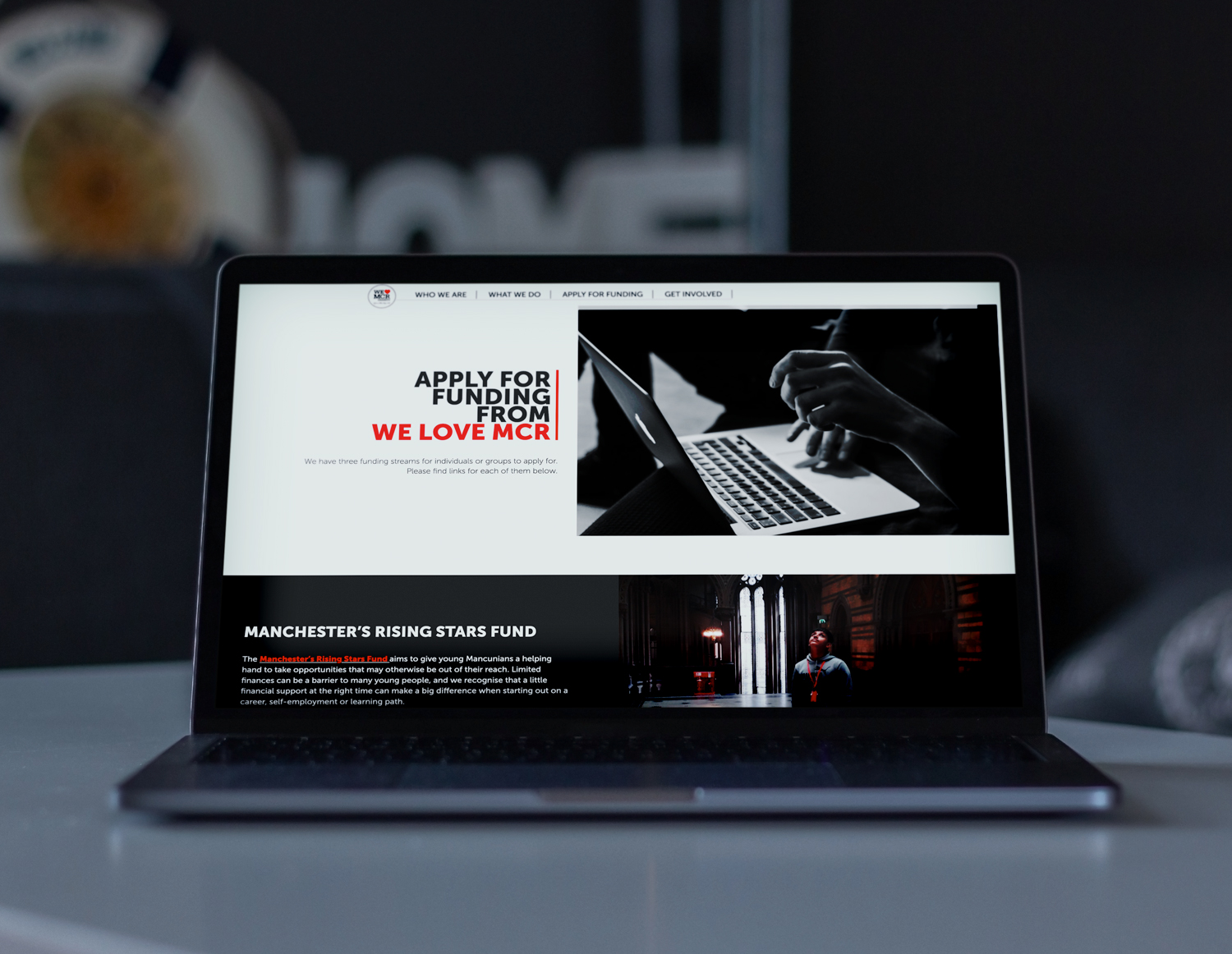
Designing and developing a new website for the We Love MCR Charity was a heart-warming project for us.
Run as the charitable fund for The Lord Mayor of Manchester’s office, it’s built on the city’s proud history of solidarity and making a stand for those who need help.
They support young Mancunians by funding work experience with some of Manchester’s top employers and help strengthen communities and families through grants and programmes, such as therapeutic family breaks aimed at building confidence, self-esteem and new skills.
And in line with the charity’s ‘Give a little, help a lot’ messaging, the relatively small part we’ve played has made a real impact for this fantastic organisation.
An industrious development
Working alongside the Lord Mayor’s charity, Manchester City Council commissioned us to create a new bespoke web development to front its compassionate campaign.
It needed to be better targeted towards the charity’s stakeholders, users and the media to help raise the charity’s profile and visibility while creating a much-improved user experience and perception of the organisation.
The previous site lacked flexibility, so we ensured its successor was user-focused and developed on a more adaptable and accessible platform.
It needed to incorporate key functionalities such as newsletter subscriptions (GDPR compliant), social media integrations, internal staff portal, an online donation link and a grant application page.
In other words, in true Mancunian style, it had to be all-singing, all-dancing, loud, proud, innovative, and hard-working, not mention completely reflective of the charity’s incredible ethos and pivotal role.
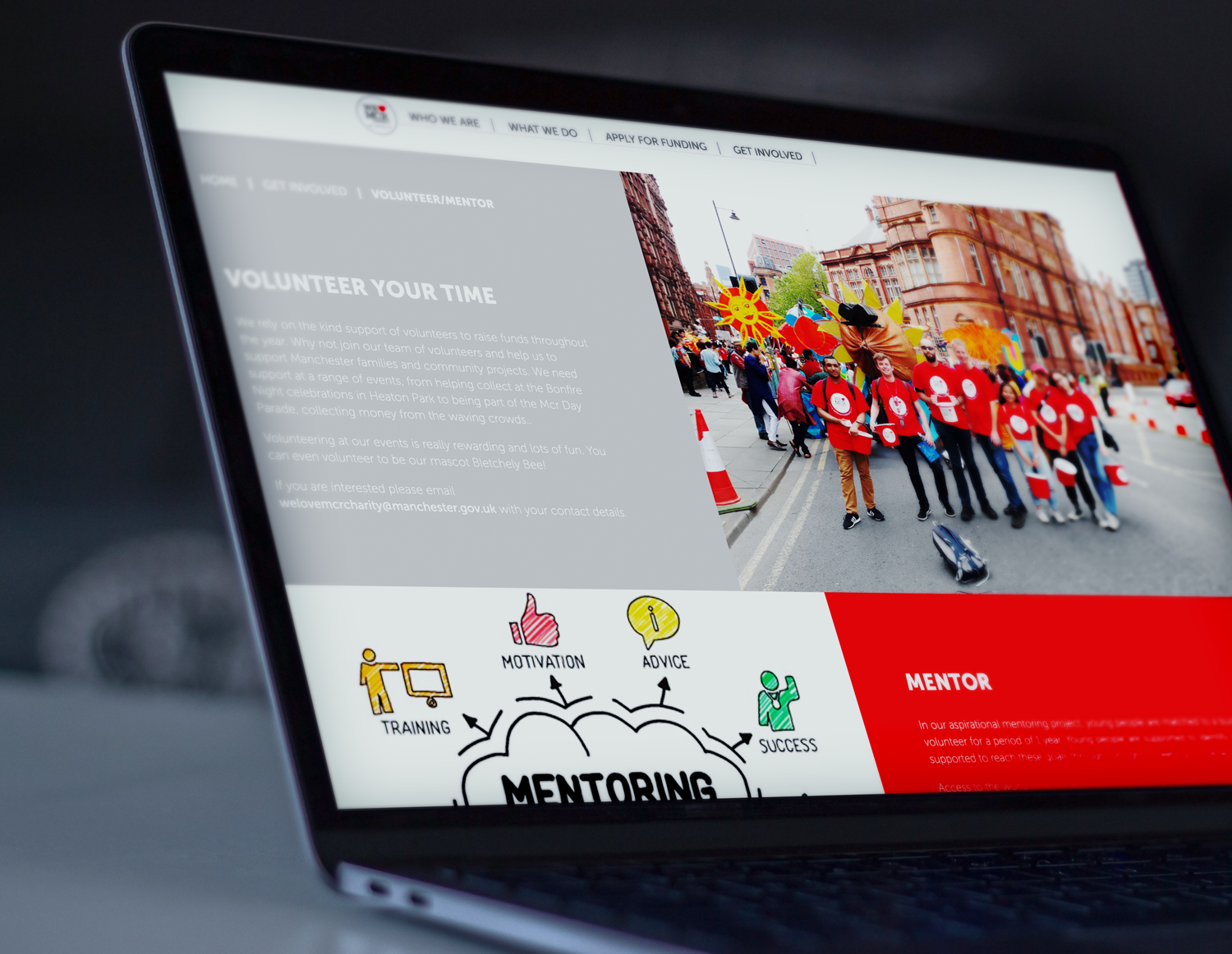
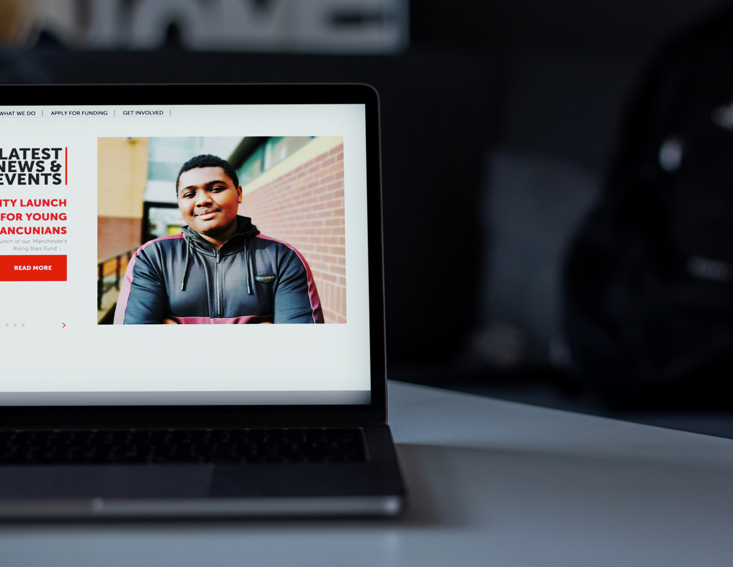
What’s not to love about a project like this?
A UX (user experience) discovery workshop is a great place to start on projects like this, helping us to establish those essential audience insights which are crucial to the design and development process.
From there we mapped out personas of each user group to capture their goals and information requirements in detail.
We drew up site maps, wireframes and content plans before our highly experienced designer Nic took over the reins to create the visual element of the site.
Take it away Nic…
“I couldn’t wait to get started on this design. It was so very rewarding to work on and to be a part of a project that has such a positive, community-based impact on my home city.
“In terms of the design I wanted to keep it clean, fresh and as simple as possible to allow the imagery, impressive stats and information do the talking. I achieved this through keeping the colour pallet to a minimum and through the use of a simple, clean yet strong font family.
“It was great to see my design brought to life through the coding wizardry of our dev team and to hear of the on-going impact our work continues to have on this exceptionally worthy cause.”
Live on the Manchester stage
The site was developed on a highly bespoke WordPress platform and built in-line with the latest legislation, W3C guidelines and Google best practices, ensuring compliance, accessibility and search engine friendly code and structures.
Mobile-optimised, it utilises Google API integrations and social media integrations.
We also integrated HTML5 and CSS techniques that make for a polished user experience, ensuring increased online traffic and better customer journeys.
Another key consideration was admin accessibility for Manchester City Council staff.
This involved hooking up the site to the authority’s internal communications portal, creating a streamlined and time-saving process for the team to add regular, updated content.
The new website was launched on our dedicated web server, which is built for speed and high traffic volumes.
This project had pride at its heart and created a website the We Love MCR Charity is truly proud of.
For us, it’s doesn’t get any better.
As an ethical, full-service agency built on results, reputation, reliability and relationships we work alongside a host of charities and organisations in NHS marketing, healthcare marketing and the life science sector to help them achieve their marketing goals and ambitions.
Our integrated offering enables us to offer expertise across a wide range of marketing services including strategy and research, design, digital marketing, public relations, print production and signage.
From an extension to in-house teams to strategic partnerships, we provide flexible and adaptable solutions to support all marcomms activities regionally, nationally and globally.
To find out more, email us at clients@cornerstonedm.co.uk
You can keep up to date with our client work and latest industry insights by connecting with Cornerstone Design & Marketing on LinkedIn.
Our Work
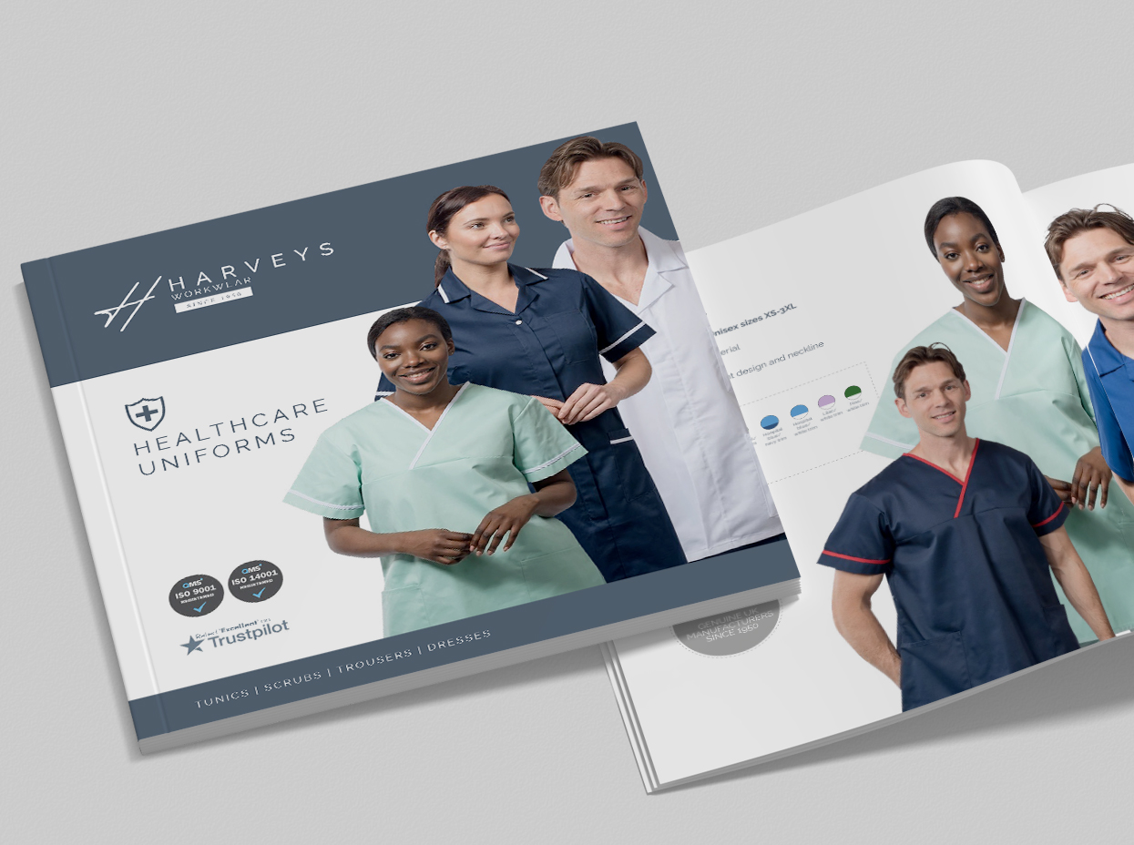

NWAS Star in a car
Award winning PR for NWAS’s Star in a Car campaign
A worthy campaign with a very worthy outcome, North West Ambulance Service’s (NWAS) ‘Star in a Car’ recruitment drive is a shining example of our award-winning work.
We collaborated with NWAS to help them rev up their regional search for volunteer car drivers to transport patients to routine hospital appointments.
The delivery and outstanding outcome of Star in a Car earned a gold accolade in the Public Sector Marketing Campaign category of the Chartered Institute of Public Relations’ 2019 North West PRide Awards.
As the UK’s most prestigious nationwide awards scheme – which recognises excellence in public relations and communications – judges said they were ‘impressed by how the team reached out beyond its traditional supporters, using innovative social media channels to really engage a younger audience with the work this essential public service delivers,’ adding ‘overall this was an excellent campaign fully deserving of success’.
Here’s how we reached out to the everyday heroes who became the stars of those cars and clinched that special accolade…
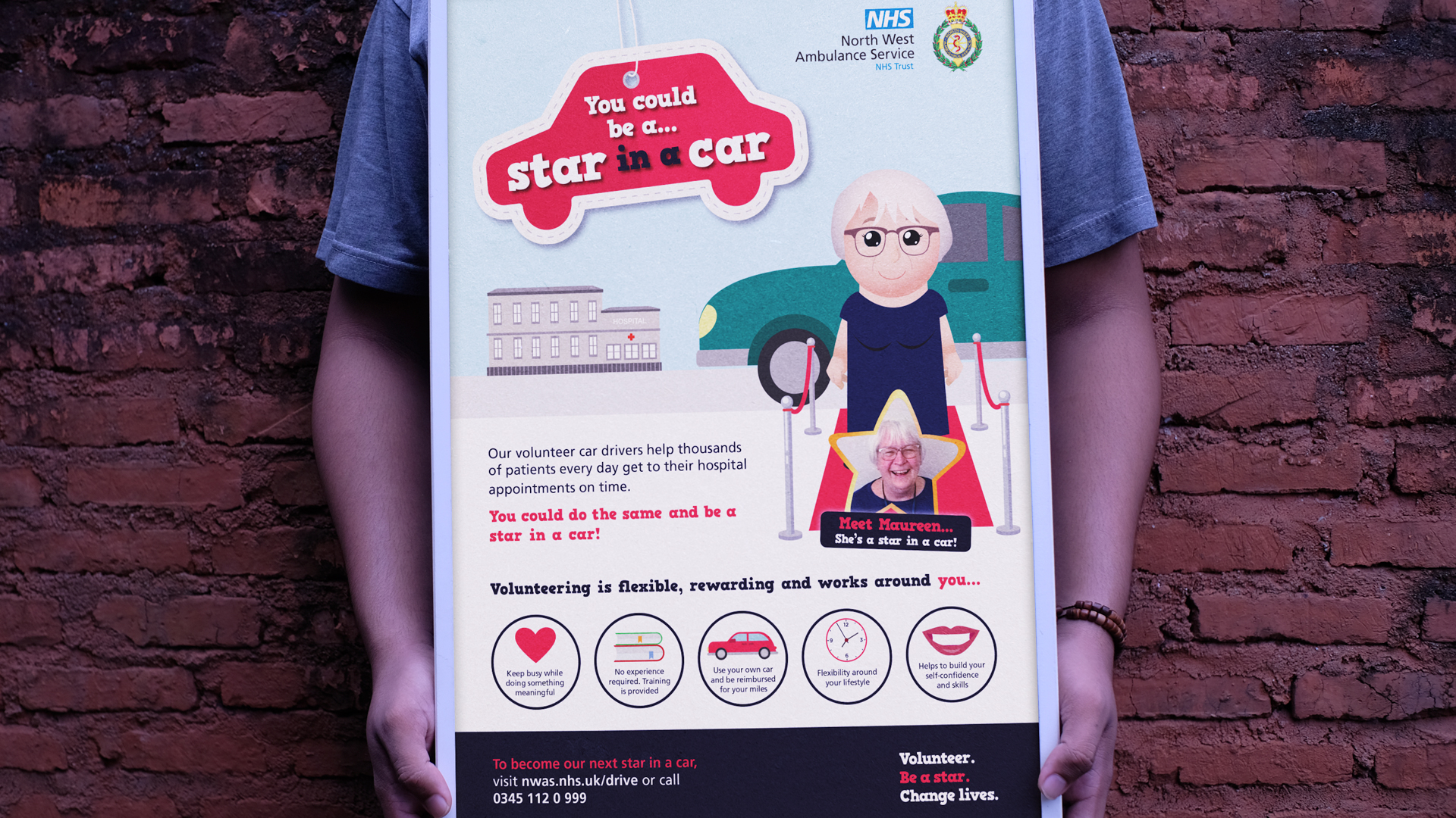
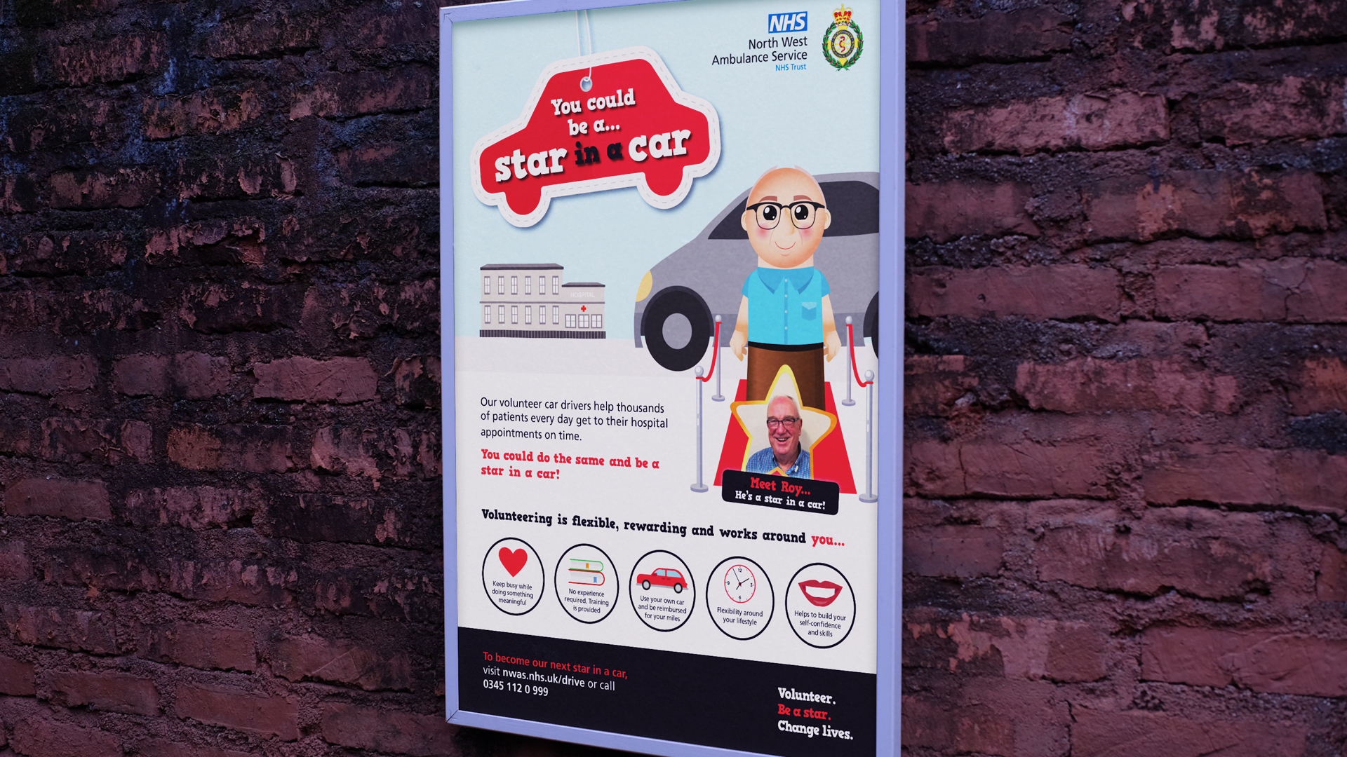
Shining a spotlight on the real heroes
The brief and objectives for Star in a Car were to create a brand / campaign theme, raise awareness of the role within North West communities and drive traffic to its dedicated web pages.
It involved a full marketing strategy, drawing on the expertise of our marketeers and PR, design and digital marketing teams.
We used initial research into the profile of existing volunteers and discovered the common theme was a desire to give back to a ‘much-valued’ service either through personal experience or that of family and friends.
To assist our PR planning, we staged a focus group with a number of volunteers to gather insight and opinions on their role.
A discovery session with the NWAS Patient Transport staff, who support the volunteers, helped us to establish key USPs to attract recruits including high level skills training such as first aid, health and safety, safeguarding and computer literacy.
Research also revealed the prospective volunteer online application process was a long-winded process and desperately needed attention.
The campaign headline soon took shape, positioning ‘Star in a Car’ as a celebration of the many unsung heroes who volunteer their time to help others on a daily basis.
Concepts, tactics, creativity and innovation
As with all successful recruitment campaigns messaging needs to be targeted, engaging and effective.
We were seeking kind, caring, community-spirited individuals – obviously with a set of wheels – who wanted to make a difference while gaining valuable skills in return.
This was achieved by communicating clear, first-hand perspectives that the public could trust and relate to, reducing their perceived barriers to volunteering.
It focussed around the need for their support while demonstrating the perceived value as real stars within NWAS and their communities.
Using the NWAS house style echoed in previous campaign collaborations, our designers created 2D vectored characters based on existing volunteer drivers.
They were depicted stepping out of their cars on to red carpets to emphasis their valued status alongside a star-shaped image to introduce the real-life volunteer.
We combined these concepts with concise and appealing messaging, rolling out across numerous marketing activities including printed leaflets and posters, outdoor and pop-up event banners, social media marketing, press advertisements and the NWAS website – even quirky branded car air-fresheners.
Our in-house videographer produced a short film based on a volunteer’s story and it was released on YouTube and shared across social media channels.
Social posts were scheduled over a number of months to drip feed content.
We timed posts to capitalise on the interest in NWAS during a BBC1 ambulance documentary broadcast and used paid ads to promote ‘Star in a Car’ in areas where volunteer numbers were particularly low.
The final yet significant stop-off during the Star in a Car journey was to widely publicise the campaign via the north west media.
As a PR agency, our PR team crafted and distributed press releases which told the stories of existing volunteers, reaching out to local and regional newspapers and radio and TV broadcasters.
This secured coverage in publications across all five north west counties followed by interviews with NWAS Patient Transport staff and existing volunteers on ITV’s Granada Reports and six hospital radio stations.
In the six months following the launch of Star in a Car the campaign produced:
- Over 250 phone enquiries (an increase of 2,500%)
- 196 applications
- 50 new volunteers have joined the Star in a Car network with others waiting for inductions
- Star in a Car web page: 5,012 views (a 31% increase compared to the previous period) YouTube video: 655 view
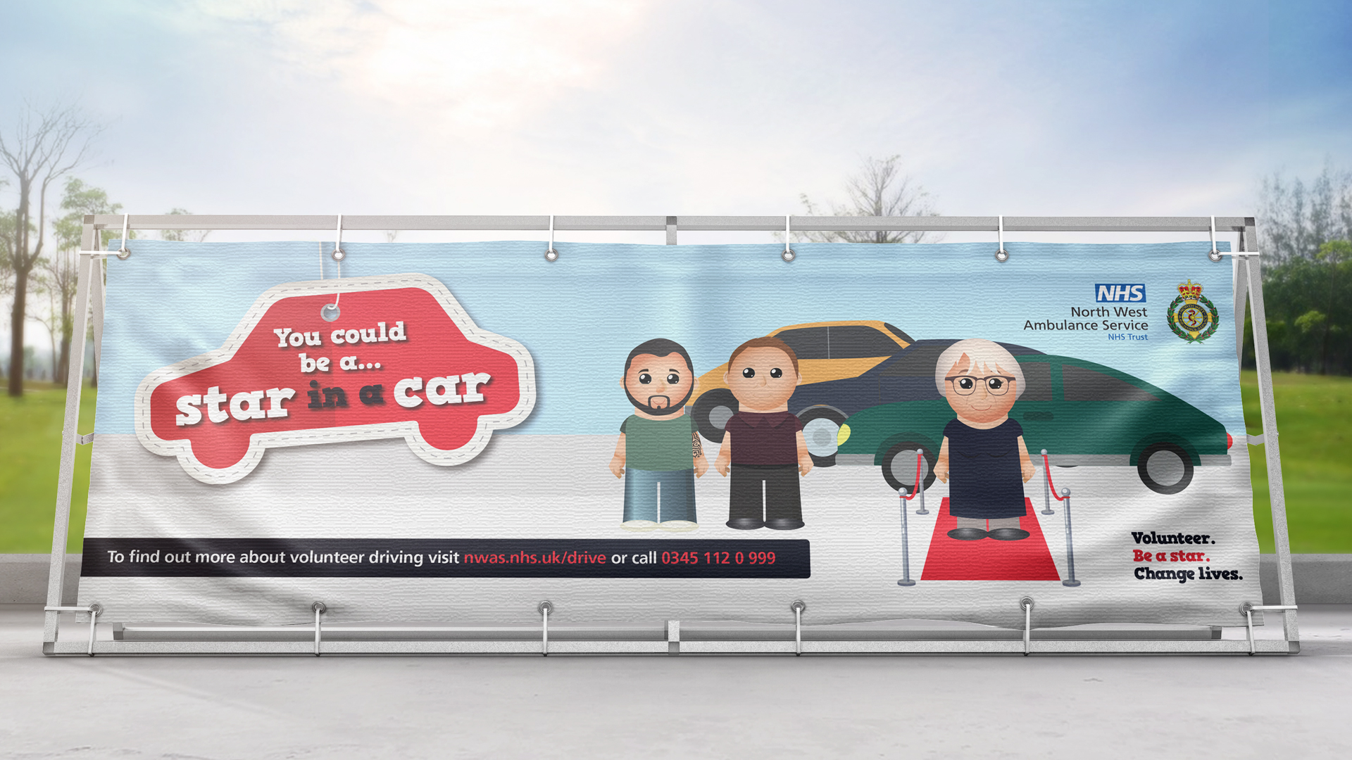
The impact and strategy
Incredibly the whole strategy, campaign activity and excellent results were achieved using limited resources.
The impact of the additional volunteers saved the NHS a significant amount of expenditure, helping reduce the use of taxi transport which on average costs eight times more than volunteer expenses.
And there was a huge effect on morale of existing volunteers as the campaign helped to generate a real sense of belonging and demonstrated NWAS’s deep gratitude.
Alongside NWAS, we work on creative campaigns for a number of NHS organisations including The Christie Hospital, NHS Oldham, NHS HMR CCG, Manchester CCG alongside regional ad hoc projects and on-going marketing support.
As a full-service marketing agency we offer our services under strategic partnerships or to compliment the skillsets of in-house teams.
We’re renowned for our strategic and creative approach to achieve efficient, engaging and results-driven outcomes.
To find out more email us at clients@cornerstonedm.co.uk
Keep up to date with our client work and latest industry insights by connecting with Cornerstone Design & Marketing on LinkedIn
Our Work
LTE
Not only do we have the honour of having one of Europe’s leading manufacturers and suppliers of laboratory and medical equipment on our Cornerstone doorstep, we’re also privileged to be associated with its impressive growth and expansion.
Manufacturing is a core sector for our agency and LTE Scientific, based in Greenfield, Oldham, was among the key drivers of our successful industry portfolio as one of our original clients almost a decade ago.
LTE is both well established and well respected within the science and medical industries, manufacturing and supplying a superior range of steam sterilisation systems and thermal processing equipment to public and private life science and medical sectors.
About LTE
Regarded as industry specialists, designing and manufacturing in-house, LTE is also renowned for exceptional after-sales support, providing expert service/testing of laboratory and medical equipment.
Established over 60 years ago, the family-run firm has seen significant growth and investment in recent times.
During the first wave of the Covid-19 pandemic it rose to the unprecedented challenge of urgent autoclave supply and installation to allow the critical commencement of coronavirus testing at a ‘lighthouse’ laboratory in Alderley Park, Cheshire – a science park offering the widest range of scientific services in the UK. It also secured further business with one of the upcoming UK vaccine manufacturers to provide special sterilisers to assist in bulk vaccine production.
And it’s maintained demand and production throughout the virus outbreak to enable it to continue to supply its essential equipment and service to healthcare providers and laboratories across the UK.
Here’s how we’ve been helping LTE – a retainer client drawing on the support of a wide range of our marketing services including digital, design, PR and video production – to maintain its presence on a national and global scale.
Professionalism, extensive expertise and exceptional customer service are essential elements to LTE’s success.
When it came to developing its new website, the objective was to not only reflect these significant aspects but also seamlessly maintain its ethos of efficiency and reliability.
We were briefed to build a new site to further leverage its strong position within the marketplace, heavily focussing on a streamlined and succinct user experience.
Ahead of design we carried out a full UX (user experience) review to identify audience touchpoints and areas of functionality.
Bespoke features included an autoclave selector tool, which was custom-built to help customers easily find the right product to suit their requirements.
As well as featuring its wide range of laboratory autoclaves, sterilisation product solutions and maintenance services, the site needed to accommodate a resources portal with downloadable manuals and certificates.
We also incorporated a news and blog section to keep customers in the loop with LTE announcements and activities, as well as updates on new appointments and existing staff who are highly valued as a core asset to the business.
Our designer developed a clean and clinical visual identity for the site to reflect the nature of LTE’s products.
There was emphasis on differentiating the company’s three service areas of medical, scientific and maintenance and this became a strong focus within the layout and structure of the site within the navigation and banner area on the home page.
The design itself incorporates large elements of white space to echo the clinical environments of the sectors LTE serves.
We created product imagery to support this alongside video for added visual appeal and ‘bursts’ of the brand’s signature colour; crimson red.
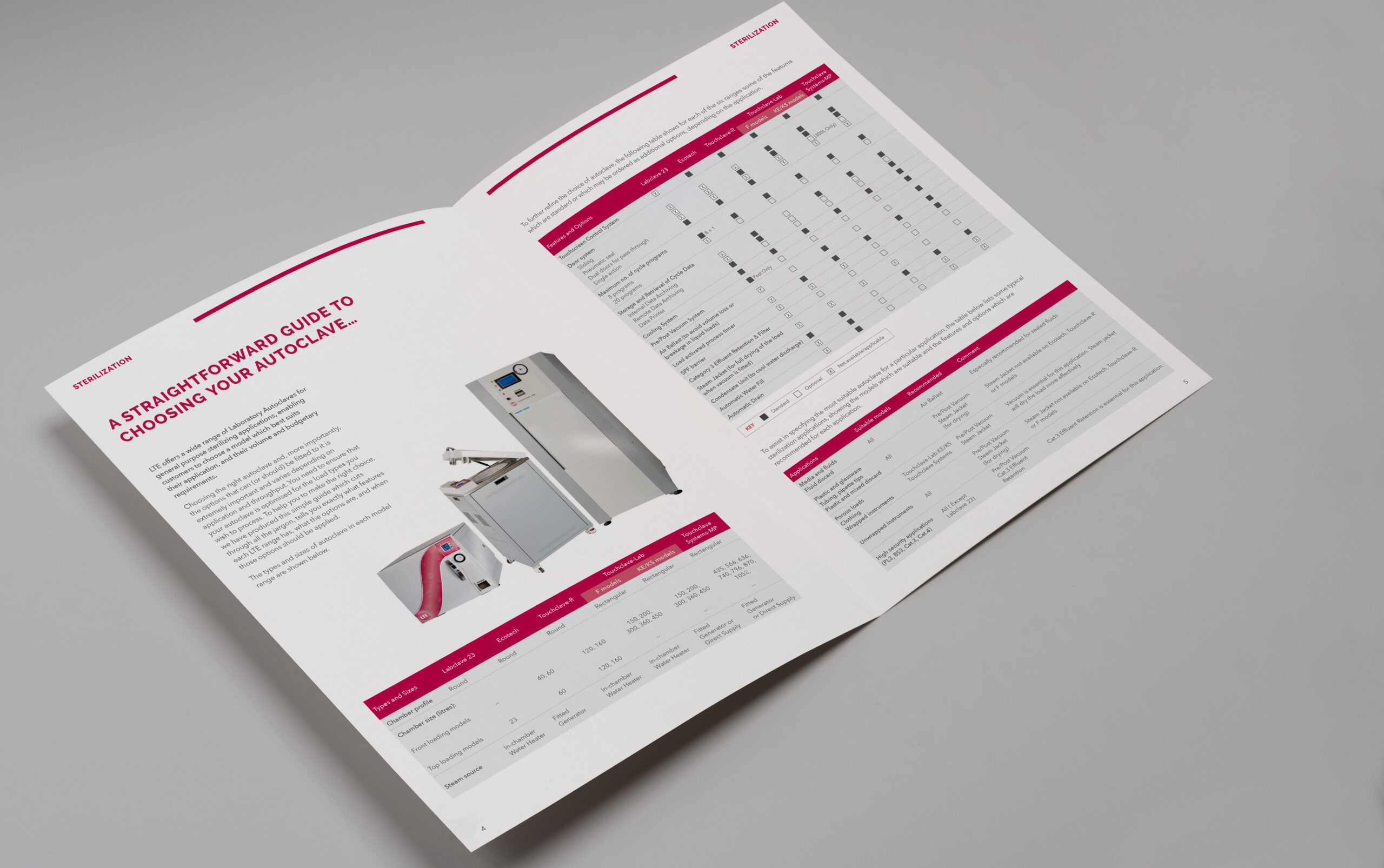
Time for an upgrade
Based on its continuing commitment to customer service excellence, LTE decided to further invest in its website in 2020, commissioning upgrades to enhance user experience through optimised navigation.
This streamlined the product search process with a brand-new product category page to showcase its entire laboratory and medical equipment ranges.
Individual product pages were redesigned to replicate the clean visual appeal seen throughout the website and navigation was enhanced to smooth and assist the product selection process.
We amplified CTAs, providing customers with a quick and simple way to get in touch with the LTE team for further assistance through a ‘contact us’ tab consistently displayed on every page.
As the hub of LTE’s sales and marketing activities we developed a tactical digital approach to heighten search visibility and drive traffic to the site.
This was hinged on an ongoing SEO and PPC strategy designed to generate high quality reach and traffic while consistently improving Google search rankings.
Within 12 months SEO increased the number of new users by 43%, page sessions by 35% and the ranking of keywords by 15%.
PPC saw astounding results securing a 262% increase in traffic and an increase of 2.39 million impressions.
It reduced the average CPC (cost per click) by 38% and increased CTR by 0.5%.
The overall holistic strategy developed for LTE saw a direct traffic increase of 94%, confirming a huge online shift for LTE which led to them far out-performing competitor sites whilst dramatically increasing reach and engagement.
Developing meaningful relationships
In 2020 we expanded our service offering to include PR, targeting trade media and local, regional and national news and business media outlets to announce LTE business developments, product expansions and industry insights.
We’re also developing a series of blogs and case studies for the website as well as exploring opportunities to expand their online video library following our production of a short video case study into an autoclave installation for the Royal Liverpool Hospital.
Initial results into shining an industry-wide and news media spotlight on LTE via two press releases into Covid-related developments, business expansion and a new product offering secured an audience reach of around 400,000.
This included coverage in industry titles such as the Health Estate Journal, the Clinical Services Journal and Labmate alongside The Business Insider North West and local newspapers such as The Oldham Times.
As part of our on-going PR strategy for LTE the exposure helped to further brand awareness within LTE’s target sectors and among local and regional business audiences.
It also enabled us to develop those all-important valuable relationships with key media contacts.
Providing comprehensive marketing service including design, digital, PR, print production and signage we offer our areas of expertise under strategic partnerships or to compliment the skillsets of in-house teams.
We’re renowned for our strategic and creative approach to achieving efficient, engaging and results-driven outcomes.
To find out more email us at clients@cornerstonedm.co.uk
Keep up to date with our client work and latest industry insights by connecting with Cornerstone Design & Marketing on LinkedIn